MrReid.org launched on 30th August 2007. Last year I published a Five Year Review, and I thought I’d follow that up this year with a review of 2012-2013.
September
My two favourite posts from September had a common theme: refractive index. Demonstrating Refractive Index, a video of a neat refractive index magic trick, made it to the top of reddit’s r/science subreddit, and My Favourite Photograph from the Olympics continued the refractive index theme, looking at a neat demonstration of total internal reflection.
October
Surviving Acceleration is a neat post that I’ve referred to on many occasions in my teaching, especially when trying to explain the usefulness of logarithmic graphs, and I’ve also gone back to Tog a number of times, especially when looking at the mathematics of thermal energy transfer and Newton’s Law of Cooling.
How are Mushroom Clouds Formed? answered a question I’d always wondered about, and is something that I point people towards when they (understandably) assume that mushroom clouds and nuclear weapons are intrinsically linked.
November
An excellent podcast inspired Solved Games, and a couple of interesting papers from the arXiv inspired Earthquake Cloak, a post about shielding buildings from earthquakes. I wrote about Blood Types because I was teaching the topic at the time.
December
December saw a rare non-science related post as I got obsessed with publishing for BERG’s Little Printer and I finally got around to finding out why resistors have strange values. I also wrote about mach cones and fission-fragment rockets.
January
In January I looked at Gravel Gerties, which are used for the manufacture and maintenance of nuclear weapons, and Whipple Shielding, which is used to protect spacecraft. I also wrote about a very old-fashioned pregnancy test and looked at GPS in Space.
February
There were no really outstanding posts in February, but I love the visuals of Rifling and have surprised a lot of people with the Energy Density of Coal.
March
I love Radomes, so it was inevitable I’d write about them at some point and I was also very interested by the Mean Centre of World Lighting. I found the topic of Depth Perception in Jumping Spiders very interesting, but I’m not sure I explained it particularly well.
April
April was a busy month, with a trio of posts about nuclear weapons: The Trestle, the Composition of Nuclear EMPs, and Critical Mass and Fizzles. I was also very pleased with a post about Google’s “Leap Smear“.
There was also a dumb April Fools post.
May
In May I finally worked out what the problem with Disk Drive Sizes is, and looked at the mysterious FOGBANK, as well as touching upon the risk of asteroid collisions and how satellites are pointed.
June
A post about Automatically Removing Objects from Photographs continues to get a lot of attention and I was also pleased with On the Emission of Light and Laser Gyroscopes.
July
July was a bit of an odd one, with a bunch of unconnected posts like Fish Ladders, the colour you see with your eyes closed and the Galileo Thermometer.
August
In August I finally worked out how cooling towers work and what Lagrange Points are, as well as writing a very popular post about bullshit marketing equations.
So here’s to 2013-14. I hope you’ll keep reading.
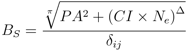

 represents the amount of utter bullshit that this equation is. The subscript is there to make it look a bit more sciency.
 represents public appeal, which has no sensible unit, and is squared because most people remember the squared symbol from when they were at school and it looks really sciency without being too threatening. The
  term is also included because the
  and
and  don’t kern properly for some reason and it will make graphic designers angry.
 represents column inches, which has the unit of inches and is the only term with a unit, meaning that the final unit of utter bullshit is
  which is, as expected, utter bullshit. It and the
  represents Not Understanding What An Equation Is. The lowercase subscript
  represents failing to take a consistent approach to the use of subscript in bullshit equations.
 represents Not Understanding Dimensional Analysis. It’s an uppercase delta because that symbol already has a well-understood meaning and there is therefore no reason to use it but it looks sciency and hey, we’ve come this far, right?
 term is used because by this stage it can’t make the equation any worse than it already is, nor any worse than any of the bullshit equations that have come before it.
 is the Kronecker delta where
  and
and  and is included because it looks really sciency whilst making absolutely no difference to the final result. The
  and
and  terms were determined by rolling a die. I used the Kronecker delta rather than an Iverson bracket because I don’t really know what Iverson brackets are.
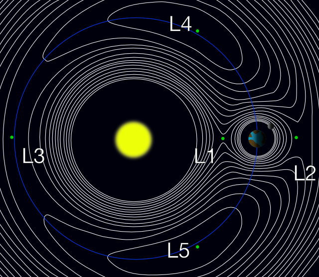