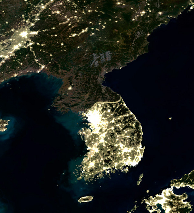
The amount of light emitted by a civilisation is closely correlated with the level of development of that civilisation. If one compares North and South Korea at night this becomes very obvious – almost the only city lit up in the DPRK is the capital Pyongyang.
A new paper* looks at the “mean centre of world lighting”, a weighted average of all the lighting on Earth. In the example maps below the mean centre of lighting is indicated in red.
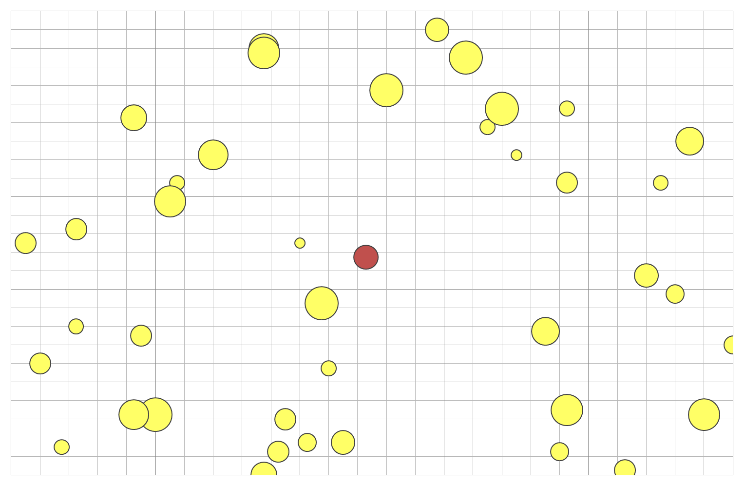 An example of a truly randomly distributed map.
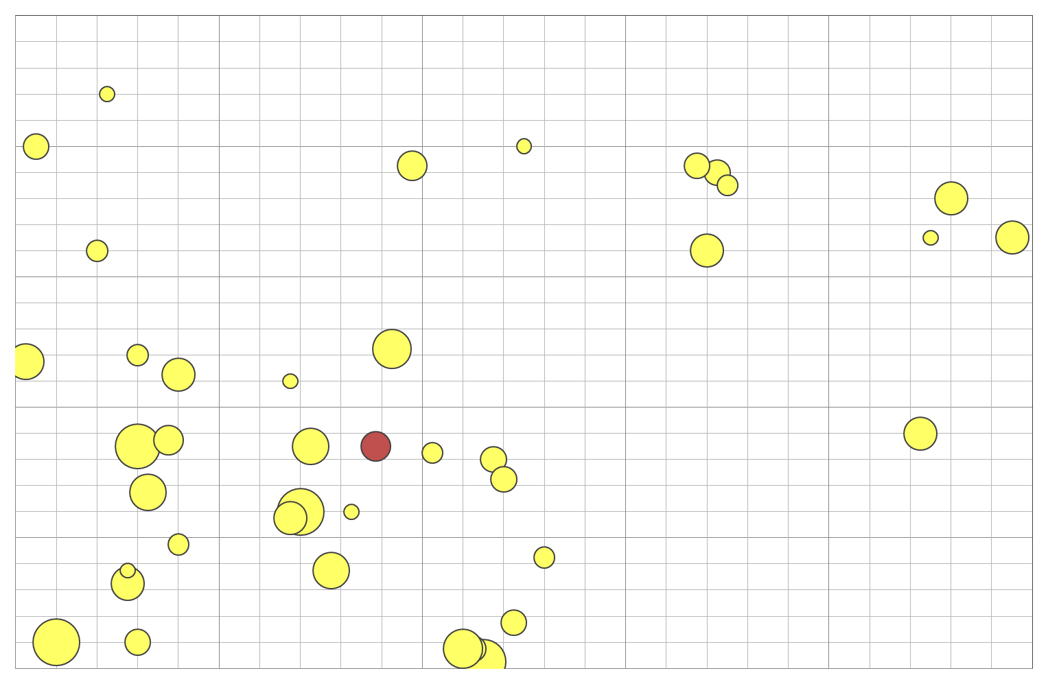 An example map in which there are more and brighter lights in the “south west” quadrant of the map.
The researchers behind the paper find that the mean centre of world lighting is moving eastwards at about sixty kilometres per year.
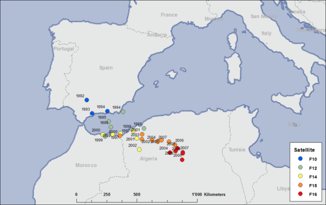
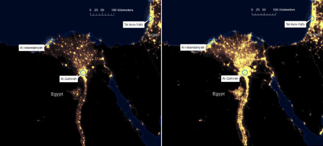
The movement of the mean centre of world lighting is primarily due to increased development in countries like India and China and the movement of rural populations to urban centres. As an example, the image below (taken from the paper) shows increased development in the Nile Delta region between 1992 and 2009.
* Nicola Pestalozzi, Peter Cauwels and Didier Sornette, “Dynamics and Spatial Distribution of Global Nighttime Lights”, arXiv: 1303.2901.
Hi. In ’92 the centre was almost exactly on the prime meridian. My guess is that US and Western Europe were balancing out each other. So the shift is also perhaps influenced by intensified energy usage in the erstwhile Eastern Europe after ’89?