This post was inspired by episode 108 of the fantastic 99% Invisible podcast.
UPC barcodes are genuinely ubiquitous. You’ve probably seen a dozen or more UPC barcodes today without even realising or think about it. But how do they work?
A UPC barcode is a graphical representation of a twelve-digit number. What a barcode reader does with that twelve-digit number is the important part from a user’s point of view, but we’re interested in how the barcode reader turns a barcode into that twelve-digit number.
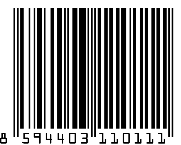
An example UPC barcode. There are thirteen written digits because the last digit is a check digit which ensures that the code has been entered correctly if it has to be entered by hand.
The first thing to realise is that a barcode is not a pattern of black lines: it is a pattern of black lines and white spaces. A UPC barcode encodes each of the twelve digits in binary, with the black bars representing 1s and the white bars representing 0s. Each digit is represented by seven bits, with each bit represented by a “sub-bar” that is either black or white.


The number 7 as represented on the left-hand side (top) and right-hand side (bottom) of a UPC barcode. In binary the representations would be 0111011 and 1000100 respectively.
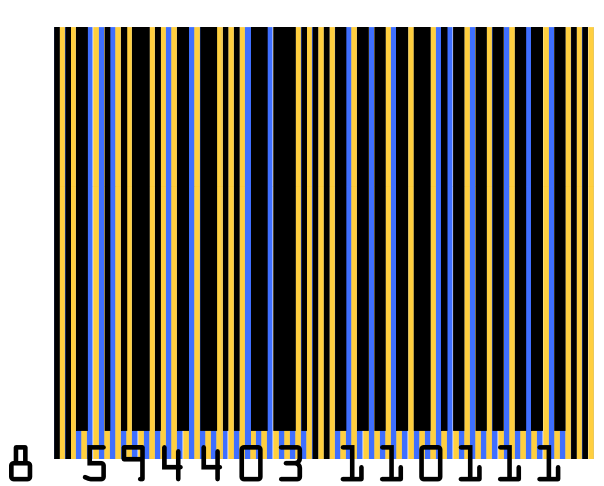
The same barcode as above, but with each line of bits (or “pixels”) coloured blue or yellow.
The barcode begins (reading in either direction) with two guide bars that let the barcode scanner know the width of each bit in the barcode, and features another set of guide bars in the centre. The number of black sub-bars for each digit is always odd on the left-hand side of the central guide bars, and even on the right-hand side, which enables a barcode scanner to tell if it is scanning a barcode right-side up or upside-down (see the representations of the number 7 above). The digits start immediately after the guide bar, but as each of the left-hand digits begin with a 0-bit, and each of the right-hand digits ends with a 0-bit, these digits never run into the guide bars or into a following or preceding digit.
With three bits (101) for each of the two guide bars on either side, plus five bits (01010) for the central guide bar, and seven bits for each of the twelve digits, this makes a total of ninety-five bits for the entire barcode. The complete binary representation of the barcode at the top of this post would be:
101 0110111 0110001 0001011 0100011 0100011 0001101 0111101 01010 1100110 1100110 1110010 1100110 1100110 101
(The bits representing the guide bars are shown in bold.)
By reading and decoding this binary series the barcode reader then provides a computer with the twelve digit UPC number, which the computer can then use to control stock, add up prices, etc.
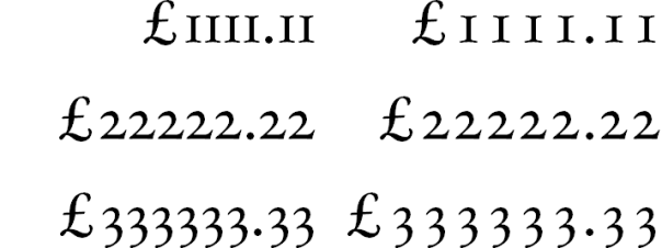
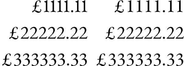
 Old style figures
 Lining figures
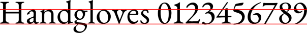
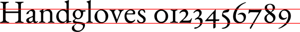


 Source:
  Source: