Tag Archives: colour

Colour Mixing

or Why do screens and monitors use red, green and blue pixels whereas printers use cyan, magenta and yellow ink?

The human eye contains three types of cones, light-sensitive cells that are sensitive to specific wavelengths (rather than rods, which are sensitive only to brightness/darkness).

The sensitivity of the three types of cones peak at wavelengths of 564-580 nanometres, 534-545 nm and 420-440 nm. These correspond to red, green and blue light, and by comparing the signals from the three types of cones the brain creates colours along red-green and blue-yellow axes (hence why there is no such colour as “greenish-red” or “yellowish-blue”). White light is created by the brain when all three cones are stimulated by the same amount.

For a colour to be perceived light must enter the eye. The big difference between the pixels on a computer screen and the inks used in printing is that light from screens enters the eye directly whereas light from printed materials must be reflected first. Screens use additive colour mixing, and printing inks use subtractive colour mixing.

test-motorbike

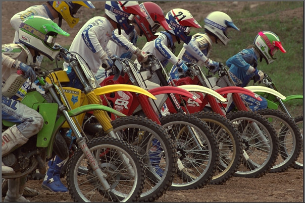
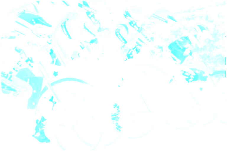
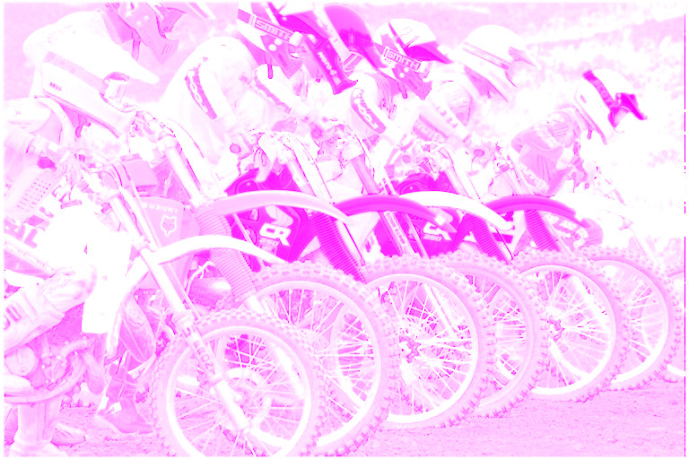
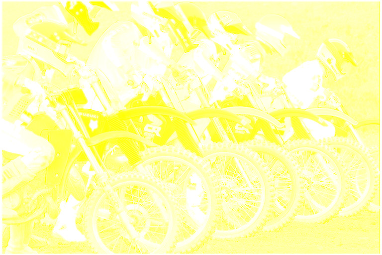
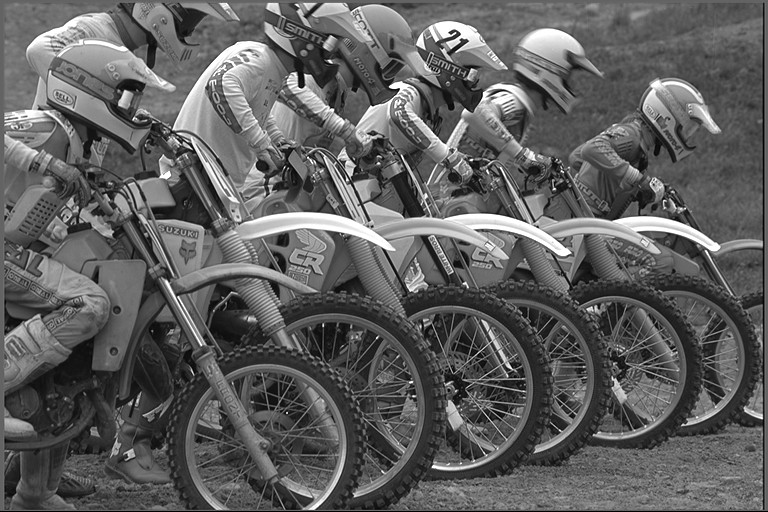
Source: Kodak test image library

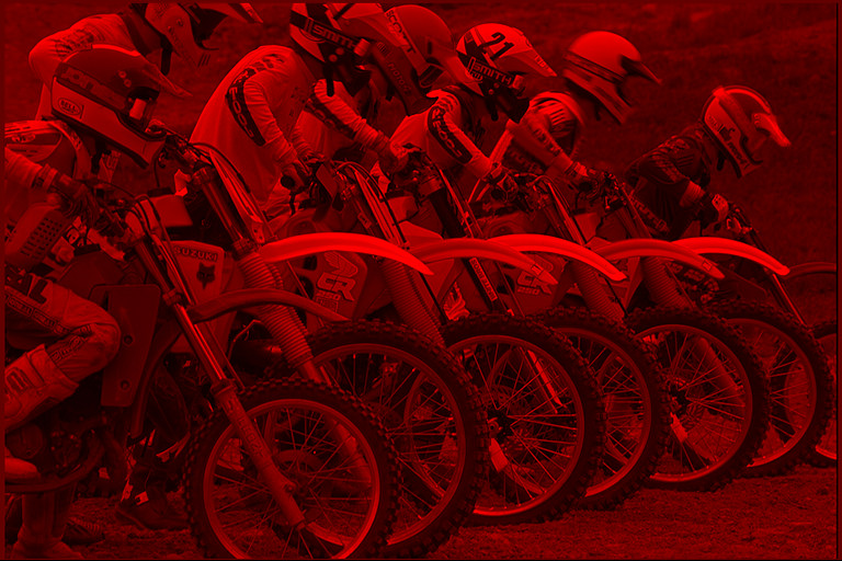
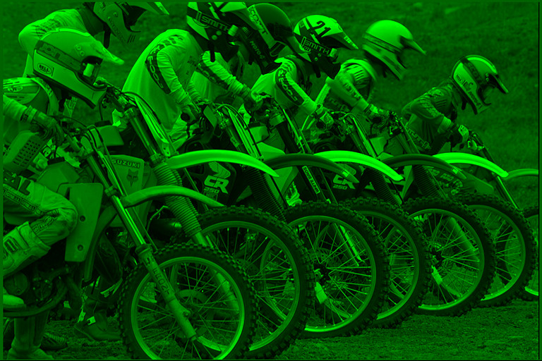
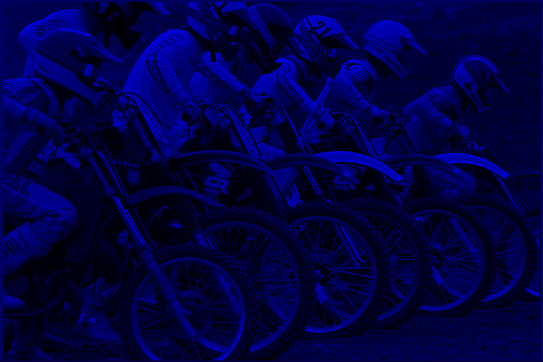
To create the test image shown above on a screen, which emits light, the image is split into red, green and blue components. The darker areas are where less light is emitted.

test-motorbike-Rtest-motorbike-Gtest-motorbike-B

To create this image in print, the image is split into cyan, magenta, yellow and black components (because the mix of cyan, magenta and yellow alone does not produce a perfect “strong” black, and would require the images to be lined-up perfectly). The lighter areas are where less ink is printed.

test-motorbike-Ctest-motorbike-Mtest-motorbike-Ytest-motorbike-K

If both red and green light enter the eye in equal amounts, the brain creates the colour yellow.* To create the colour yellow on the printed page, both red and green light must be reflected from the page, and the only way to do this is to absorb blue. If yellow text is viewed under a blue light it will appear black, as all the light incident on the ink will be absorbed.

Colour Additive (Light) Subtractive (Inks)
Red Emit red Absorb green and blue
Green Emit green Absorb red and blue
Blue Emit blue Absorb red and green
Cyan Emit green and blue Absorb red
Magenta Emit red and blue Absorb green
Yellow Emit red and green Absorb blue

If cyan and magenta inks are printed on top of each other and illuminated by white light, the cyan will absorb red and the magenta will absorb green. The net effect of this is that only blue light is reflected, so printing cyan and magenta on top of each other creates the perceived colour blue.

If you tried to do this with, for example, red and green ink, the result would be black, as the red would absorb the blue and green and the green would absorb the red and blue. The reason you cannot print using red, green and blue inks is that red, green and blue ink absorbs more than one colour, whereas cyan, magenta and yellow do not. The only way to produce light colours is to start with light inks.

Ink Absorbed Reflected Colour Perceived
Cyan Red Green and blue Cyan
Magenta Green Red and blue Magenta
Yellow Blue Green and red Yellow
Cyan + Magenta Cyan absorbs red Blue Blue
Magenta absorbs green
Magenta + Yellow Magenta absorbs green Red Red
Yellow absorbs blue
Cyan + Yellow Cyan absorbs red Green Green
Yellow absorbs blue

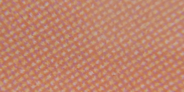
If you’d like proof of the table above, try printing out squares of red, green and blue and looking at them under a microscope.

magnifier-colours

blue-ink

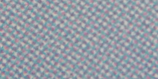
It is easy to see, in the image of blue ink above, the cyan and magenta “pixels” (drops of ink) that create the blue colour. It’s more difficult, but possible, in the image of red ink below to see the magenta and yellow “pixels”.

red-ink

* There is no way to guarantee that both you and I perceive the colour that we call yellow in the same way. We might both call it yellow, but we could be seeing vastly different things.

Eigengrau

Close your eyes. What colour do you see? Black? Look again.

eigengrau

Eigengrau (“intrinsic grey”), also called “dark light” or “brain grey” is the dark grey colour “seen” in the absence of light. Eigengrau appears lighter than a black object viewed in normal light because the brain prioritises contrast over true colour representation. For example, in the diagram below the two circular dots are the same colour, but appear to be different because of the way that they contrast with their backgrounds.

contrast-illusion

Eigengrau is produced when rhodopsin molecules undergoing a process of spontaneous isomerisation, indistinguishable from the process that would occur if the rhodopsin molecule had been struck by an incoming photon of light. In individual rod cells these events occur only about once every 100 seconds, but as there are about 125 million rod cells in each human eye this level of background signal is enough to produce eigengrau.

Plug wiring colour scheme

UK plugs use brown insulation for the live wire, blue insulation for the neutral wire and green with yellow stripes insulation for the earth wire.

But why this particular combination of colours? The answer is deceptively simple: there is no type of colour blindness that will result in these wires becoming confused.

Above: how a UK plug looks to someone who is red-green colourblind.

Above: how a UK plug looks to someone who is blue-yellow colourblind.

One of the lesser-known safety features of a UK plug is the extra distance that the neutral wire has to travel when compared to the live wire. If someone pulls on the mains cable the live wire will disconnect first, making the plug safer.

Under the IEC 60446 standard only black, brown, red, orange, yellow, green, blue, violet, grey, white, pink and turquoise are acceptable colours for labelling wires. Countries must choose an appropriate selection of colours that eliminates the possibility of confusion.

IEC 60446 colours. From top to bottom: normal vision, deuteranopic vision, tritanopic vision.

Continue reading

Colour blindness

Following on from an earlier post about the human eye’s inability to see the colour blue in detail, I’m taking a look at colour blindness.

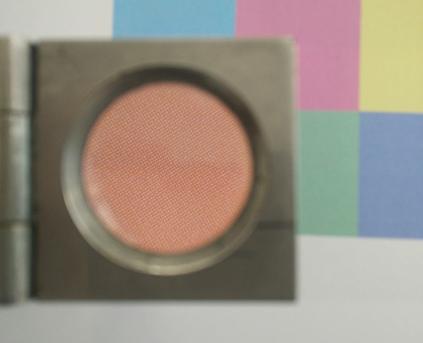
I’ll be using this test image of a forest and rainbow throughout.

The two most common types of colour blindness both occur in the red-yellow-green part of the colour spectrum and are commonly referred to as red-green colourblindness, because sufferers cannot distinguish between the two colours. In both cases red and green appear yellow (i.e. as a combination of red + green = yellow).

An inability to perceive the colour red is called protanopia and occurs in some form in about 2% of males and 0.01% of females.

An inability to perceive the colour green is called deuteranopia and is the most common, occurring in some form in about 7% of males and 0.4% of females.

Protanopia and deuteranopia are very similar, but there is a subtle difference between the two if you look very carefully. The difference is easier to see in the animation below that flicks back and forth between the two.

The reason that protanopia and deuteranopia are more common in males than females is that colour blindness is most commonly inherited from a gene on the X chromosome. Men (XY) have a much higher risk than women (XX) because the colour-blindness gene is recessive: with two X chromosomes there is a chance that one of the Xs has the normal colour vision gene and that will dominate.

The third form of colour blindness, tritanopia, is much rarer and not sex-linked, because the gene that controls it is carried by chromosome seven which is present in both sexes. It occurs in about 0.01% of the population and results in short wavelength blue light being shifted towards longer, greener wavelengths. If protanopia and deuteranopia are red-green colourblindness then tritanopia could be described as blue-yellow colourblindness.

Your eyes are not good at seeing blue

Here is a image of the Bangkok skyline.

Here is the same image with the red, green and blue components shown separately.

Notice how white objects are bright in all three components, how the green park on the right of the image appears brightest in the green component, how the orange streetlights are bright in both the red and green components and so on.

Below is the same excerpt from the image but with the detail removed individually from the red, green and blue components by pixellating each by a factor of ten.

Original:

Red detail removed:

Green detail removed:

Blue detail removed:

Notice the difference? Getting rid of the blue detail makes no real difference to the image at all. You have to look very carefully to see the change that removing the blue detail makes:

The human eye contains about 120 million “rods” and 6 million “cones”. The rods, concentrated around the fovea centralis are responsible for fine detail but only detect light and dark, not colour (in physics terms, they are photodetectors).

The cones are split into three groups, making human beings trichromats who see in three colours, (as opposed to most non-primate mammals which are monochromats that see only in black and white).

It’s this mis-match in the sensitivity of the eye to blue that causes the eye’s inability to see detail in blue.