What is the significance of the areas highlighted in green on the map below?
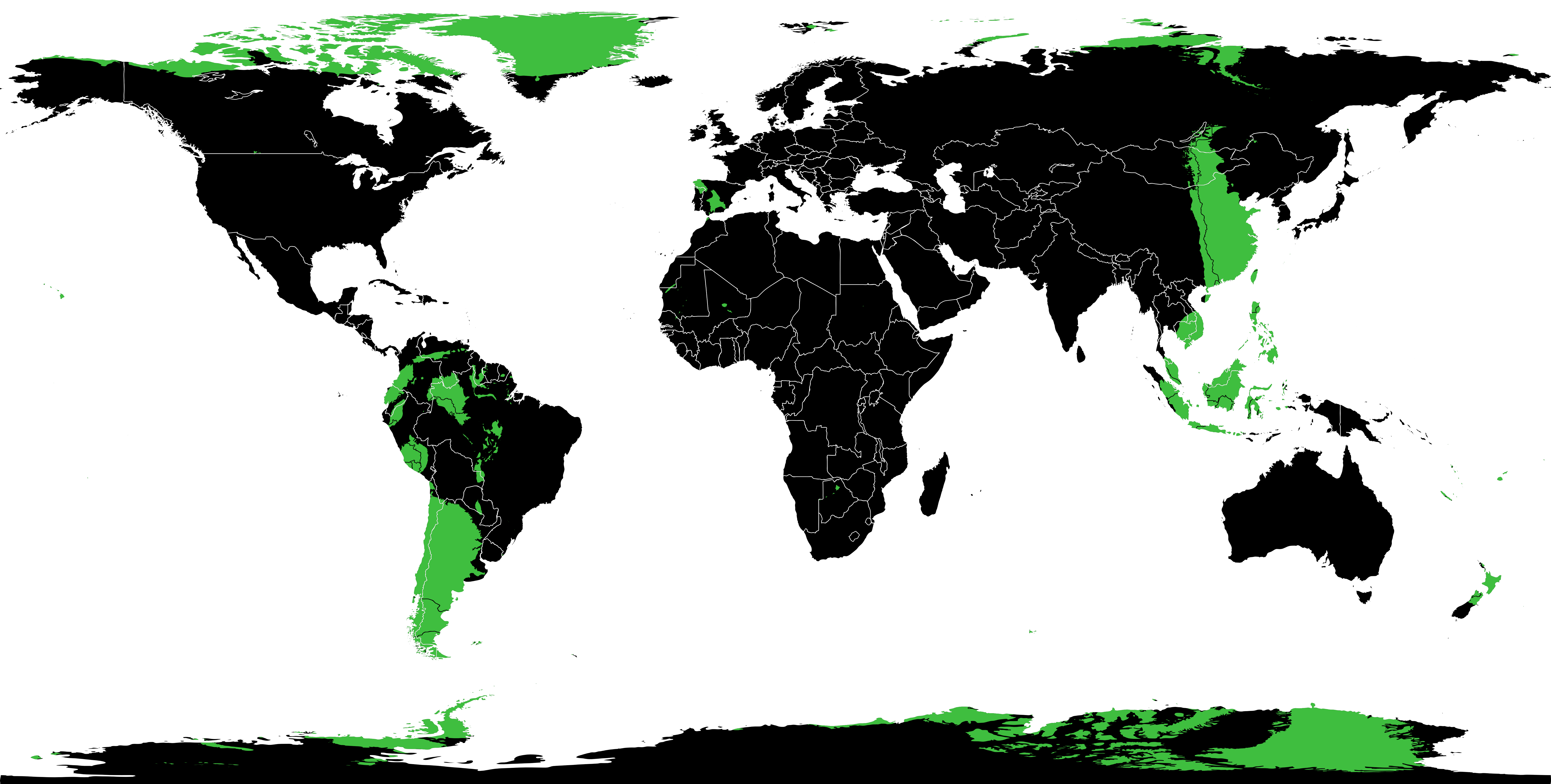
Click for a much larger version.
The highlights indicate areas where there is land on both sides of the globe – that is, areas where you could create a successful Earth Sandwich.
For example, if you started in Northern Argentina and drilled through the Earth’s core you would end up in Southern China. If instead you started in southern Argentina you’d end up either in Mongolia or Russia. It’s a little bit easier to understand if you look at the overlaid maps below.

There are significant areas of overlap between South America and around the South China Sea, and between Northern Canada & Greenland and the Antarctic.
There are also some interesting smaller spots, for example where Spain/Portugal (and a tiny portion of Morocco) and New Zealand overlap, or the Islands of Hawai’i and Botswana.
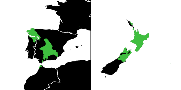
Spain/Portugal/Morocco and New Zealand
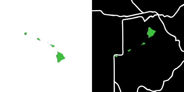
Hawai’i and Botswana


