Tag Archives: climate

Why You Shouldn’t Worry About Melting Icebergs

iceberg

When the topic of climate change comes up, a common refrain is that the melting of icebergs is going to drown us all. This is not true. Even if every iceberg in the world melted, we wouldn’t notice the difference.

Archimedes’ Principle states that an object which displaces a fluid (i.e. a liquid or a gas) will experience an upward force that is equal to the weight of the fluid displaced. If an object displaces one cubic metre of water it will experience an upward force of around 9810 newtons, regardless of what it is made from. If its own weight is greater than 9810?N it will sink; if it is less than this it will float.

The density of ice is approximately 920 kilograms per cubic metre, and the density of seawater is approximately 1025?kg/m3. If a cube of ice with sides of one metre is placed into water it will push down on the water with a force of 9030?N (920?kg × 9.81?N/kg), and the water will push upwards on the ice with a force of 10?100?N (1025?kg × 9.81?N/kg). There will therefore be a net upward force on the ice cube of 1030?N and it will float to the surface. However, the ice cube will not float completely above the surface of the water – some of the ice cube will stay submerged.

The volume of the ice cube that is submerged will be equal to the volume of water that has the same weight as the cube itself, or mathematically:

We can find the volume of the ice that is submerged by calculating:

V_{\mathrm{submerged}} \times \rho_{\mathrm{water}} \times g = W_{\mathrm{ice}}

That is, the volume of the ice that is submerged (V_{\mathrm{submerged}}) multiplied by the density of the water (\rho_{\mathrm{water}}) multiplied by the strength of the gravitational field (g) is equal to the weight of the ice cube (W_{\mathrm{ice}}).

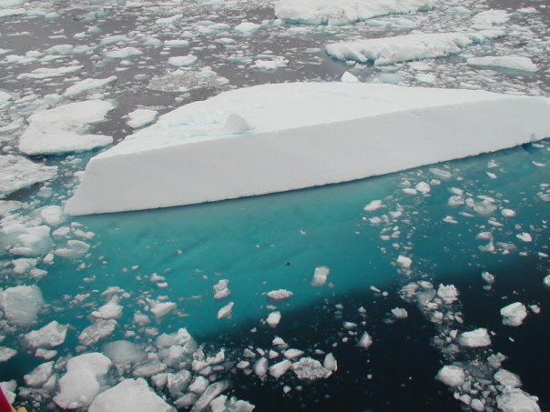
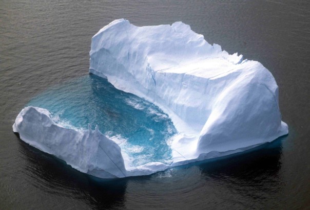
An iceberg, with the submerged portion clearly visible underwater.

Using the data we know, we find that the volume of ice submerged is 0.898?m3. This result applies regardless of the shape or size of our ice cube, so we know that 89.9% of any iceberg is below the surface of the water, and 10.2% is above. People seem to be worried that when the ice melts, this above-surface water will be added to the volume of the world’s oceans. However, this fails to take into account the different densities of ice and liquid water. As the ice melts into liquid water its density increases and thus the level of the water remains the same. You can prove this to yourself very easily: place an ice cube into a glass of water, draw a line at the level of the water, and wait for the ice to melt. The level of the water will not climb above your original line.*

What people should be worried about is not icebergs but ice caps. Ice caps are ice that it sitting on land and therefore is not already displacing water. If this ice melts and runs into the oceans it certainly will increase sea levels.

What people should also be worried about is that the density of water changes with temperature. As climate change increases the temperature of the oceans it will expand, and again sea levels will rise.

Note: This is all based on a mathematical-physical model. When other factors are taken into consideration, melting icebergs may contribute very slightly (about 50 micrometres per year) to an increase in sea level.

The Hawaiian climate

The Köppen climate classification defines a number of different climate types.

Group A (Tropical Humid)

  • Tropical Rainforest
  • Tropical Monsoon
  • Tropical Wet and Dry / Savanna

Group B (Dry)

  • Steppe
  • Desert

Group C (Mild Mid-Latitude)

  • Dry-Summer Subtropical / Mediterranean
  • Humid Subtropical
  • Maritime Temperate / Oceanic
  • Temperate Highland Tropical with Dry Winters
  • Maritime subarctic / Subpolar Oceanic

Group D (Severe Mid-Latitude)

  • Hot Summer Continental
  • Warm Summer Continental / Hemiboreal
  • Continental Subarctic / Boreal / Taiga

Group E (Polar)

  • Tundra
  • Ice Cap

koppen-map

A map of the world coloured using the extended Köppen-Geiger scheme which features twenty-nine climate types.

Hawai’i, the largest of the Hawaiian islands, features ten of the thirteen Köppen Climate Types.

At the summits of Mauna Kea and Mauna Loa the climate type is Polar Tundra. Below the summits of the Hawaiian mountains are narrow bands of Continental Subarctic climate, and below that a region of Warm Summer Continental climate. The largest area of Hawai’i is covered by Hot Summer Continental climate.

Moving towards the coast there are regions of Tropical Rainforest, Tropical Wet and Dry, Humid Subtropical and even a tiny region of Tropical Monsoon climate. Towards the north-east of Hawai’i there are even small regions of Steppe and Desert climate.

hawaii-false-colour

A false-colour image of Hawai’i showing the different types of land use.

Yearly variations in the storage of CO2 by plants

The maps below show the production of carbon dioxide by plants versus its absorption. The greenest areas are those that are storing the most carbon, where plant growth is greatest (grey areas indicate no plant life).

The map above shows the world in August, summer in the northern hemisphere. Note the particularly heavy absorption of carbon dioxide in the tropical rainforests of Bolivia, Peru, Brazil and other South American countries and the production of algae off the west coast of Africa.

The map below shows a much different picture, the world in December when it is winter in the northern hemisphere and summer in the southern hemisphere.

Storage of carbon dioxide by plants reaches its lowest point in December, causing the atmospheric concentration of carbon dioxide to peak.

It’s easy to see why plant production peaks when maps of incoming solar radiation for August and December are compared. The bright yellow areas are those receiving high amounts of incoming sunlight; the dark red areas receive the least.

August 2010

December 2010

Also interesting to compare are maps showing the balance of radiation. The orange areas in the maps below are those which are absorbing more radiation than they emit, and green areas are those which emit more radiation than they absorb.

The difference between areas near the equator that receive year-round sunlight and areas nearer the poles where sunlight is seasonal is quite marked; Greenland remains a net radiator throughout the year due to northerly position and its year-round white reflective coating of ice and snow.

August 2010

December 2010

UK Energy Mix

A lot of people get confused between the electricity they use and the energy they use.

It’s easy to forget that the majority of people use natural gas for heating (e.g. a gas-fired central heating system) and cooking and petrol for transport; electricity only makes up a small part of the mix.

The graph below shows how the UK’s “energy mix” has changed over the last forty years.

Electrification peaked between 1994 and 1998, the same time that nuclear power was at it’s peak in the UK. Greater electrification would be a benefit to the environment as electricity is a low-carbon fuel, especially when nuclear and renewables make a large contribution to the fuel mix. Also the “Dash for Gas” in the ’90s is clearly visible as a very marked increase in the size of the blue section.