Tag Archives: statistics

What is “Five Sigma” Data?

or “Why do some experiments take such a long time to run?”

Before you go any further, watch the first minute of this video of Professor Andrei Linde learning from Assistant Professor Chao-Lin Kuo of the BICEP2 collaboration that his life’s work on inflationary theory has been shown by experiment to be correct.

The line we’re interested in is this one from Professor Kuo:

“It’s five sigma at point-two … Five sigma, clear as day, r of point-two”

You can see, from Linde’s reaction and the reaction of his wife, that this is good news.

The “r of point-two” (i.e. r = 0.2) bit is not the important thing here. It refers to the something called the tensor-to-scalar ratio, referred to as r, that measures the differences in the polarisation of the cosmic microwave background radiation caused by gravitational waves (the tensor component) and those caused by density waves (the scalar component).

The bit we’re interested in is the “five sigma” part. Scientific data, particularly in physics and particularly in particle physics and astronomy is often referred to as being “five sigma”, but what does this mean?

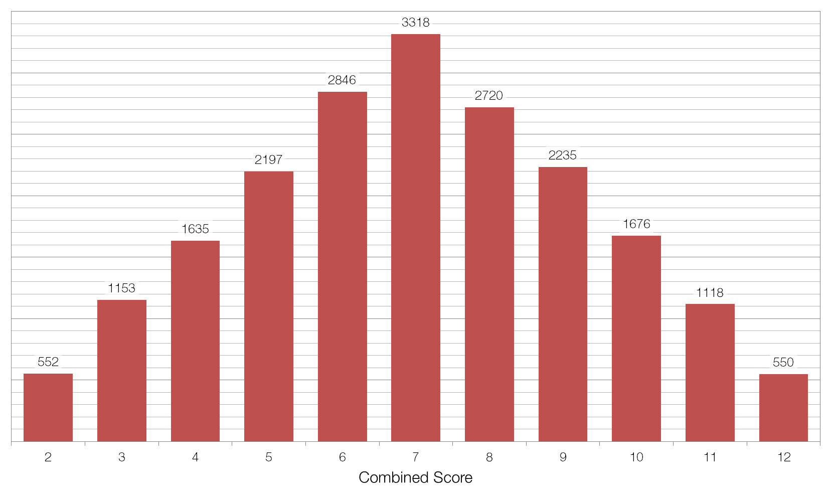
Imagine that we threw two non-biased six-sided dice twenty thousand times, adding the two scores together each time. We would expect to find that seven was the most common value, coming up one-sixth of the time (3333 times) and that two and twelve were the least common values, coming up one thirty-sixth of the time (556 times each). The average value of the two dice would be 7.00, and the standard deviation (the average distance between each value and the average) would be 2.42.

I ran this simulation in Microsoft Excel and obtained the data below. The average was 6.996 and the standard deviation (referred to as sigma or ?) was 2.42. This suggests that there is nothing wrong with my data, as the difference between my average and the expected average was only 0.004, or 0.00385 of a standard deviation, and this is equivalent to a 99.69% chance that our result is not a fluke, but rather just due to the expected random variation.

20000-throws-fair

Now imagine that we have a situation in which we think our dice are “loaded” – they always come up showing a six. If we repeated our 20000 throws with these dice the average value would obviously 12.0, which is out from our expected average by 5.00 or 2.07 standard deviations (2.07?). This would seem to be very good evidence that there is something very seriously wrong with our dice, but a 2.07? result isn’t good enough for physicists. At a confidence level of 2.07? there is still a 1.92%, or 1 in 52, chance that our result is a fluke.

In order to show that our result is definitely not a fluke, we need to collect more data. Throwing the same dice more times won’t help, because the roll of each pair is independent of the previous one, but throwing more dice will help.

If we threw twenty dice the same 20000 times then the expected average total score would be 70, and the standard deviation should be 7.64. If the dice were loaded then the actual average score would be 120, making our result out by 6.55?, which is equivalent to a chance of only 1 in 33.9 billion that our result was a fluke and that actually our dice are fair after all. Another way of thinking about this is that we’d have to carry out our experiment 33.9 billion times for the data we’ve obtained to show up just once by chance.

This is why it takes a very long time to carry out some experiments, like the search for the Higgs Boson or the recent BICEP2 experiment referenced above. When you’re dealing with something far more complex than a loaded die, where the “edge” is very small (BICEP2 looked for fluctuations of the order of one part in one hundred thousand) and there are many, many other variables to consider, it takes a very long time to collect enough data to show that your results are not a fluke.

The “gold standard” in physics is 5?, or a 1 in 3.5 million chance of a fluke, to declare something a discovery (which is why Linde’s wife in the video above blurts out “Discovery?” when hearing the news from Professor Kuo). In the case of the Higgs Boson there were “tantalising hints around 2- to 3-sigma” in November of 2011, but it wasn’t until July 2012 that they broke through the 5? barrier, thus “officially” discovering the Higgs Boson.

Averages

An average is way of expressing, in a single figure, important information about a population.

The arithmetic mean is probably what you think of when you think of average. To find the arithmetic mean you sum all the values in your set, and then divide by the number of values. So the arithmetic mean of 1, 1, 2, 3, 5, and 8 is 20/6 or 3⅓.

The median is the middle value within a set when the set is arranged in order. So the median of 1, 1, 2, 3, 5, 8, 13 is 3, because 3 is the fourth value in a set of seven values. If the number of values in the set is even, then the median is half-way between the two middle values. Therefore the median of  1, 1, 2, 3, 5, 8 is 2.5, because 2 and 3 are the third and fourth value in a set of six values.

The median is useful when your data contains outliers. For example, in a class of ten pupils who score 91%, 92%, 93%, 94%, 95%, 96%, 96%, 98%, 99% and 10% the arithmetic mean average is 86.5%. Does this seem correct? Would it be correct to report this as the class’s “average mark”? In this situation it’s more sensible to report the median mark, which in this case is 95.5%.

The median is the most resistant average – it takes a great deal of contamination (e.g. by outlier values) to cause it to breakdown and give an arbitrarily large or small value. To corrupt the median value, more than 50% of the data have to be “contaminated”, in which case your data-collection process is probably fundamentally flawed.

The mode is the most common value within a set. So the mode of 1, 1, 2, 3, 5, 8 is 1, because 1 appears twice and the rest of the numbers only appear once. The mode is the only average that makes sense when dealing with non-numerical data: the mode eye colour (brown in the UK), or the mode surname (Smith in the UK), for example.

The geometric mean is useful when you are comparing values that have different ranges. For example, take the two computers specified below:

CompuTron 9001 Comp-O-Matic A1
Clock Speed /GHz 4.00 4.50
RAM /GB 4.00 8.00
Hard Disk /GB 1250 1000
Arithmetic Mean 419 338
Geometric Mean 27.1 33.0

The CompuTron 9001 scores higher on the arithmetic mean because the size of the hard disk has a disproportionate effect (it is of the order of 103, whereas the clock speed and RAM values are of the order of 100), but the geometric mean shows that the Comp-O-Matic A1 is better overall.

The geometric mean of a set of n values is the nth-root of the product of the values in the set, or in algebraic terms:

\bar{x}_{GM}=\left(\prod_{i=1}^n{x_i}\right)^{\frac{1}{n}}

The geometric mean is also useful when your data has a very large range. For example, if we looked at the gross domestic product (GDP) of ten countries picked at random we might end up with the data shown below:

Country GDP /$bn Country GDP /$bn
Slovenia 50.3 Spain 1480
Niger 6.38 Ukraine 165
USA 15000 Bermuda 5.97
Albania 13.0 Jordan 28.8
Monaco 5.92 Croatia 62.5

Here the largest value (USA) is more than two-and-a-half thousand times larger than the smallest value (Monaco). Is it fair to say that the “average” GDP for countries in this list is the arithmetic mean of $1680 billion, when nine out of the ten countries in the list have a GDP less than this, and seven of the ten have a GDP less than one-tenth of this? For these countries the geometric mean of $62.9 billion might be a better choice. (The median is probably not a good choice as we have a very limited data set with a long tail.)

The harmonic mean is especially important in physics, particularly when dealing with rates (e.g. speed, acceleration) and ratios (e.g. resistance, capacitance). If a car drives 100 kilometres one way at 60 km/h and then back the same distance at 40 km/h you would be forgiven for thinking that its “average” speed is 50 km/h. However, this is not true as it doesn’t take account of the fact that the car spends more time at 40 km/h than it does at 60 km/h.

Calculating the harmonic mean of these two speeds using the equation below yields the correct average speed of 48 km/h.

\bar{x}_{HM}=\left(\frac{1}{n}\sum_{i=1}^n x_{i}^{-1}\right)^{-1}

The same is true when considering fuel economy: the average miles per gallon figure for two cars, one 30 mpg and one 50 mpg driving the same distance is not 40 mpg but rather the harmonic mean of the two figures, 37.5 mpg.

In a network of n resistors in parallel, or n capacitors in series, the harmonic mean of the resistors’ or capacitors’ values yields the correct average value of each resistor’s or capacitor’s contribution to the network. For example: a 90Ω and 10Ω resistor in parallel have a combined resistance of 9Ω. The harmonic mean of 90Ω and 10Ω is 18Ω, and two 18Ω resistors in parallel yield a total resistance of 9Ω. (If the resistors are in series, or the capacitors in parallel, then the arithmetic mean should be used.)

The weighted mean is similar to the arithmetic mean, but takes account of the relative contributions of each component. Consider the data below:

Subject Number of Students Pass Rate
Science 100 100%
English 400 50%
Mathematics 400 50%

A naïve Headteacher might simply take the average of 100%, 50% and 50% and claim that the overall pass rate was 68%. However, this fails to take account of the fact that far more students were studying English and Maths than were studying Science, and so the correct average pass rate was 56%.

There is not necessarily a “correct” average to use for any given situation. You should base your choice of average on trying to fulfil the criterion at the top of this post: a single number that best represents the entire set of data.

The base rate fallacy

Imagine that there is a rare genetic disease that affects 1 in every 100 people at random. There is a test for this disease that has a 99% accuracy rate: of every 100 people tested it will give the correct answer to 99 of those people.

If you have the test, and the result of the test is positive, what is the chance that you have the disease?

If you think the answer is 99% then you are incorrect; this is because of the base rate fallacy – you have failed to take the base rate (of the disease) into account.

In this situation there are four possible outcomes:

Affected by disease Not affected by disease
Test correct Affected by disease, and test gives correct result. (DC) Not affected by disease, and test gives correct result. (NC)
Test incorrect Affected by disease, and test gives incorrect result. (DI) Not affected by disease, and test gives incorrect result. (NI)

This is easier to understand if we map the contents of the probability space using a tree diagram, as shown below.

In two of these cases the result of the test is positive, but in only one of them do you have the disease.

P(DC) = P(Affected) × P(Test correct)
P(DC) = 0.01 × 0.99
P(DC) = 0.0099 = 1 in 101

The other case that results in a positive result, when you don’t have the disease and the test in incorrect has the same 1 in 101 probability: P(NI) = 0.0099.

Of the two remaining cases, not having the disease and getting a correct negative test result takes up the vast majority of the remaining probability space: P(NC) = 0.9801 or 1 in 1.02. The chance of having the disease and getting an incorrect test result is extremely small: P(DI) = 0.0001 or 1 in 10000.

Demographics and subject choice

What does your choice of A Level subjects say about you? Could I work out what sort of school you went to, based on your choice of A Levels?

The DCSF publishes figures on the uptake of A Level courses. It turns out there are some marked differences between different school types: if you’re studying Law, Sociology and Media Studies then there’s a fairly good chance you attend a State-Maintained school or an FE College.

On average, 15.1% of A Level entries are pupils at Independent Schools, but that percentage drops to 1.1% for those studying Law, 1.8% for Sociology and 2.4% for Media/Film/TV Studies.

If you’re studying “Other Modern Languages” (i.e. not French, Spanish or German, Ancient Greek or Latin), Classical Studies and Home Economics then there’s a good chance you attend an independent school.

This graph shows all subjects:

If you’re studying A Level Physics then there’s a good chance you’re at an independent school.

There’s also some interesting data about the uptake of subjects amongst the different sexes; everybody knows that there is a massive gender imbalance in A Level Physics:

But this isn’t explained by results, girls do much better than boys:

Overall there are more male A grade physicists, but this is just down to the greater uptake.

Fruit Gums and graphs

All the data from my Fruit Gums experiment has one continuous variable (the number of gums) and one discrete variable variable (either box number or flavour) so the physicist’s standard graph – the x-y scatter plot – isn’t suitable. This made it a good opportunity to try out some different graph/chart types.

A pie chart shows the relative contribution of each item to the whole.

The doughnut chart builds on the pie chart by enabling more than one set of data to be plotted – in this case all three boxes at once.

Bar charts come in two forms: horizontal and vertical. In this case there are two ways to group the bars: by flavour or by box number.

With lots of data a bar chart can become crowded and confusing and that’s where stacked bar charts become useful. A stacked bar chart overcomes this problem and can be done in two different ways: using absolute values or by percentage.