Not on the surface, I mean, but underneath? As you dig down into the Earth’s crust you will find yourself getting warmer, at a rate of about 0.025°C per metre of depth (25°C per kilometre). But why?
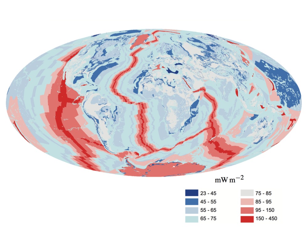
There are two sources of internal heat that make up the Earth’s internal heat budget: radiogenic heat and primordial heat. This heat flows to the surface at a rate of around 47 terawatts or 92 milliwatts per square metre of surface. This flow is uneven, with more heat flowing at mid-ocean ridges where two tectonic plates move away from each other, and more heat flowing through oceanic crust (which underlies the oceans) than through continental crust (which underlies continental land). The exact contribution of radiogenic v primordial heat to the total is unknown, but is thought to be approximately 50:50.[1]
Radiogenic heat is the heat that comes from the decay of radioactive isotopes in the Earth’s crust and mantle; most of it comes from the decay of four isotopes: potassium-40, thorium-232, and uranium-235 and -238.
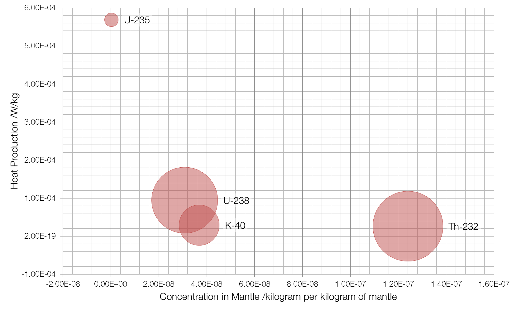
Concentration is on the x-axis, with the more common isotopes further to the right, and the y-axis measures the amount of heat produced by each isotope, with “hotter” isotopes towards the top. The area of the bubble is proportional to the amount of heat that isotope contributes per kilogram of mantle, with thorium-232 contributing the most at 3.3 picowatts per kilogram.
Primordial heat is the heat left over from the formation of the Earth. As gas and dust left over from the formation of the Sun coalesced, they lost gravitational potential energy and gained kinetic/thermal energy. The huge amount of initial heat means that Earth is still cooling even now, 4.5 billion years later.
[1] Gando A, Gando Y, Ichimura K, Ikeda H, Inoue K, Kibe Y et al. Partial radiogenic heat model for Earth revealed by geoneutrino measurements. Nature Geoscience. 2011;4(9):647-651.