There is a fundamental law of economics that says that as the price of a good or service increases, the demand for that product decreases. This is the Law of Demand: if prices are high, people cannot buy as much. But there are some products for which this is not the case.
Veblen Goods do not obey the Law of Demand: as their price increases, so does demand for them. This is a case of conspicuous consumption, people show off and demonstrate their status by buying increasingly expensive products. A £10000 gold Rolex watch does not really tell time any better than a £10 Casio, but owning a £10000 gold Rolex demonstrates that you are so wealthy that you can afford to spend £10000 on a watch. People do not want to buy a £10 Rolex, but they do want to buy a £10000 Rolex, to show off how much money they have.
There are some goods to which the Law of Demand does not apply, and which are not Veblen Goods. These are called Giffen Goods, and on the face of it, they seem to disobey all rational economic rules: demand for them increases even when their price increases, despite the fact that they cannot be used to demonstrate status via conspicuous consumption.
But imagine this situation: You need to feed your family. You normally buy a mixture of expensive (tasty) and inexpensive (staple) products to provide enough nutrition, but also some variety. But one day the price of rice quadruples: now you can’t afford the more expensive products and the rice, and you still need the staple rice to provide basic nutrition. Thus you buy more rice, even though its price has increased, and the rice is a Giffen Good.
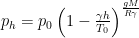
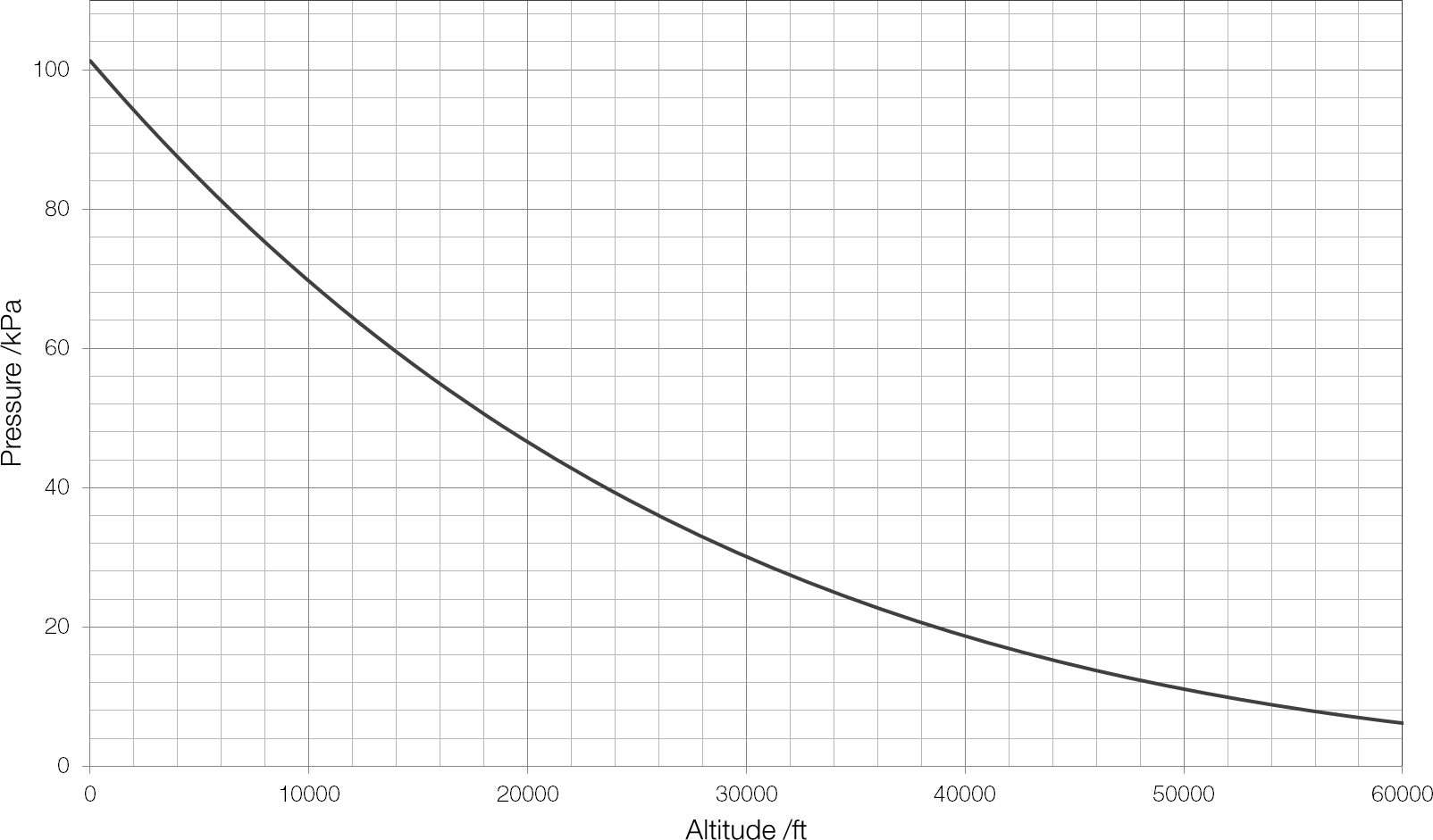
 is the pressure at height
  ;
;  is the standard atmospheric pressure of 1013.25
  is the rate at which temperature decreases with altitude (the temperature lapse rate);
  is the standard temperature;
  is the gravitational field strength;
  is the
  is the