Tons and Tonnes

Every time I see the word “ton” or “tonne” used to describe mass or weight I have to go back and check exactly what the terms mean, so for my sanity and your reference, here is an explanation of the differences.

ton-tonne-comparison

The long ton is an outdated unit, equivalent to 1016 kilograms, still sometimes used in the UK and in other countries that previously used the Imperial system of measurements.

The short ton is one of the US customary units, equivalent to 907 kilograms. For certain types of measurements (e.g. the tonnage of Navy ships) the long ton is used instead.

The tonne is 1000 kilograms, and is part of the International System of Units, which is why it it often referred to as a metric tonne.

A long ton is 12% larger than a short ton, and 1.6% larger than a tonne. A short ton is 9.3% smaller than a tonne and 11% smaller than a long ton. A tonne is 1.6% smaller than a long ton and 10% larger than a short ton. And if you read that out loud you’ll realise how dangerous using the ton/tonne can be.

2012-2013 Review

MrReid.org launched on 30th August 2007. Last year I published a Five Year Review, and I thought I’d follow that up this year with a review of 2012-2013.

September

My two favourite posts from September had a common theme: refractive index. Demonstrating Refractive Index, a video of a neat refractive index magic trick, made it to the top of reddit’s r/science subreddit, and My Favourite Photograph from the Olympics continued the refractive index theme, looking at a neat demonstration of total internal reflection.

October

Surviving Acceleration is a neat post that I’ve referred to on many occasions in my teaching, especially when trying to explain the usefulness of logarithmic graphs, and I’ve also gone back to Tog a number of times, especially when looking at the mathematics of thermal energy transfer and Newton’s Law of Cooling.

How are Mushroom Clouds Formed? answered a question I’d always wondered about, and is something that I point people towards when they (understandably) assume that mushroom clouds and nuclear weapons are intrinsically linked.

November

An excellent podcast inspired Solved Games, and a couple of interesting papers from the arXiv inspired Earthquake Cloak, a post about shielding buildings from earthquakes. I wrote about Blood Types because I was teaching the topic at the time.

December

December saw a rare non-science related post as I got obsessed with publishing for BERG’s Little Printer and I finally got around to finding out why resistors have strange values. I also wrote about mach cones and fission-fragment rockets.

January

In January I looked at Gravel Gerties, which are used for the manufacture and maintenance of nuclear weapons, and Whipple Shielding, which is used to protect spacecraft. I also wrote about a very old-fashioned pregnancy test and looked at GPS in Space.

February

There were no really outstanding posts in February, but I love the visuals of Rifling and have surprised a lot of people with the Energy Density of Coal.

March

I love Radomes, so it was inevitable I’d write about them at some point and I was also very interested by the Mean Centre of World Lighting. I found the topic of Depth Perception in Jumping Spiders very interesting, but I’m not sure I explained it particularly well.

April

April was a busy month, with a trio of posts about nuclear weapons: The Trestle, the Composition of Nuclear EMPs, and Critical Mass and Fizzles. I was also very pleased with a post about Google’s “Leap Smear“.

There was also a dumb April Fools post.

May

In May I finally worked out what the problem with Disk Drive Sizes is, and looked at the mysterious FOGBANK, as well as touching upon the risk of asteroid collisions and how satellites are pointed.

June

A post about Automatically Removing Objects from Photographs continues to get a lot of attention and I was also pleased with On the Emission of Light and Laser Gyroscopes.

July

July was a bit of an odd one, with a bunch of unconnected posts like Fish Ladders, the colour you see with your eyes closed and the Galileo Thermometer.

August

In August I finally worked out how cooling towers work and what Lagrange Points are, as well as writing a very popular post about bullshit marketing equations.

So here’s to 2013-14. I hope you’ll keep reading.

The equation for the perfect bullshit equation

Every now and then a story appears in the media about how boffins (and it is always “boffins”) have worked out an equation for something: the perfect cup of tea, the most depressing day of the year, the best way to make pancakesthe perfect handshake, or in the most recent case, the perfect cheese on toast.

The Royal Society of Chemistry, whose boffins came up with the cheese on toast equation, really ought to know better, so to save any more of our august institutions from embarrassing themselves I have come up with an equation for the perfect bullshit marketing equation.

bullshit-equation-small

The equation for the perfect bullshit marketing equation
(rendered in \LaTeX to make it look more sciency).

B_{S} represents the amount of utter bullshit that this equation is. The subscript is there to make it look a bit more sciency.

PA^2 represents public appeal, which has no sensible unit, and is squared because most people remember the squared symbol from when they were at school and it looks really sciency without being too threatening. The PA term is also included because the P and A don’t kern properly for some reason and it will make graphic designers angry.

CI represents column inches, which has the unit of inches and is the only term with a unit, meaning that the final unit of utter bullshit is \textnormal{inches}^{\frac{\Delta}{\pi}} which is, as expected, utter bullshit. It and the PA term also represent the failure of bullshit equation-makers to understand that quantities in equations are only ever represented by individual symbols.

N_e represents Not Understanding What An Equation Is. The lowercase subscript e represents failing to take a consistent approach to the use of subscript in bullshit equations.

\Delta represents Not Understanding Dimensional Analysis. It’s an uppercase delta because that symbol already has a well-understood meaning and there is therefore no reason to use it but it looks sciency and hey, we’ve come this far, right?

The CI and N_e terms are multiplied together and added to the PA^2 term because any equation worth its salt has got to have some pluses and timeses in, otherwise it doesn’t even look like an equation.

The pi-th root of the PA^{2} + \left ( CI \times N_{e} \right )^{\Delta } term is used because by this stage it can’t make the equation any worse than it already is, nor any worse than any of the bullshit equations that have come before it.

\delta_{ij} is the Kronecker delta where i=4 and j=4 and is included because it looks really sciency whilst making absolutely no difference to the final result. The i and j terms were determined by rolling a die. I used the Kronecker delta rather than an Iverson bracket because I don’t really know what Iverson brackets are.

UPDATE: For how this post came about, check out this Storify story.

Lagrange points

In a system of two bodies, where one mass is much larger than the other (such as the Sun and Earth, or the Earth and Moon), there are five points, known as the Lagrange points, where the resultant gravitational field is such that it provides the centripetal force for that object to remain in constant orbit with those two bodies.*

What this means is that an object – such as a satellite – placed at a Lagrange point will remain at that point (relative to the two bodies) without need for any external force such as that provided by rocket or ion thrusters.

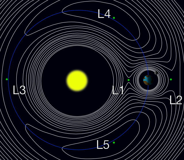
For example an object placed at point L1 in the diagram below will always remain between the Earth and the Sun and an object at L2 will always remain in the Earth’s shadow.

sun-earth-lagrange

The five Lagrange points of the Sun-Earth system. The white lines are gravitational contour lines: an object in free-fall would trace out a path along one of these contours.

L1

L1 is probably the easiest Lagrange point to understand. In the diagram above the Sun pulls towards the left, and the Earth pulls to the right, and the resultant force is just right to keep it in orbit between the Sun and Earth.

The L1 point is ideal for making observations of the Sun-Earth system as satellites placed here are never in the shadow of either the Sun or the Earth. The SOHO, ACE and WIND satellites are all positioned at L1.

L2

L2 is a good site for space-based observatories as it is almost perfectly protected from solar radiation and doesn’t receive any light pollution from Earth. The Planck telescope is currently at L2, the James Webb Space Telescope is scheduled to be placed there in 2018, and the WMAP and Herschel satellites were also previously positioned there.

L3

No satellites are currently positioned at L3, as it lies about 300 million kilometres from Earth. It has been suggested as a useful site for solar activity monitoring, as it would be able to spot any activity likely to affect Earth (sunspots, etc.) before the side of the Sun containing that activity was pointed towards Earth.

L3 is also popular in science fiction, as a place to “hide” something from Earth. After the development of interplanetary probes we checked and unfortunately there’s nothing there (yet).

L4 and L5

The L4 and L5 points lie at a 60° angle from the Sun-Earth axis, at the furthermost point of an equilateral triangle formed by the Sun and the Earth. Because this point is the same distance from both the Sun and Earth the ratio of their gravitational pulls is the same as if it were at the barycentre of the Sun-Earth system and objects placed there remain stationary. No satellites are currently placed at either point.

The Trojan asteroids are located at the L4 and L5 points of the Jupiter-Sun system. Asteroids are constantly being transferred between the asteroid belt and these two points.

* Lagrange points exist for any two-body system in which one object is much more massive than the other, but I’ll only be looking at the Sun-Earth system.

Adverts are not louder than TV shows

It is a common complaint that the adverts played during TV shows are louder than the TV shows themselves. This, however, is not the case: without adjusting the volume of your TV this would be impossible.

What is different between adverts and TV shows is the difference between the loud and the quiet parts. The loudest parts are the same volume, but the quietest parts of the adverts are louder than the quietest parts of the TV shows, and this gives the adverts the impression of being louder overall.

As an example, I took the first twenty seconds of Kalimba by Mr Scruff (one of the sample songs included with Windows 7) and compressed it.

Original version:

Compressed version:

The compressed version appears louder overall, but a comparison of their waveforms in Audacity shows that the loudest parts of both have the same volume.

waveform-comparison

The original waveform is shown at the top and the compressed waveform is shown at the bottom.
The scale on the y-axis is the same for both.

The USA has enacted a law, the Commercial Advertisement Loudness Mitigation Act (CALM Act), which mandates that the average volume of adverts may not exceed the volume of the TV shows during which they play, which does away with this compression trickery.