Yearly Archives: 2011

The most radioactive parts of the UK

The average radioactive background dose in the UK is 2.7 millisieverts. Of this 2.7 mSv, 1.35 mSv comes from radioactive radon gas leaking out of the ground.

This radioactive radon (Rn-222) is produced by the decay of uranium-238, after a series of intermediate non-gas stages that cannot escape from rocks.

Because radon has such a large effect on the annual radiation dose that someone receives, it is closely monitored. In the UK, this monitoring is done by the Health Protection Agency (HPA). One of the things that the HPA does it produce radon maps, showing which areas of the UK have the highest presence of radon.
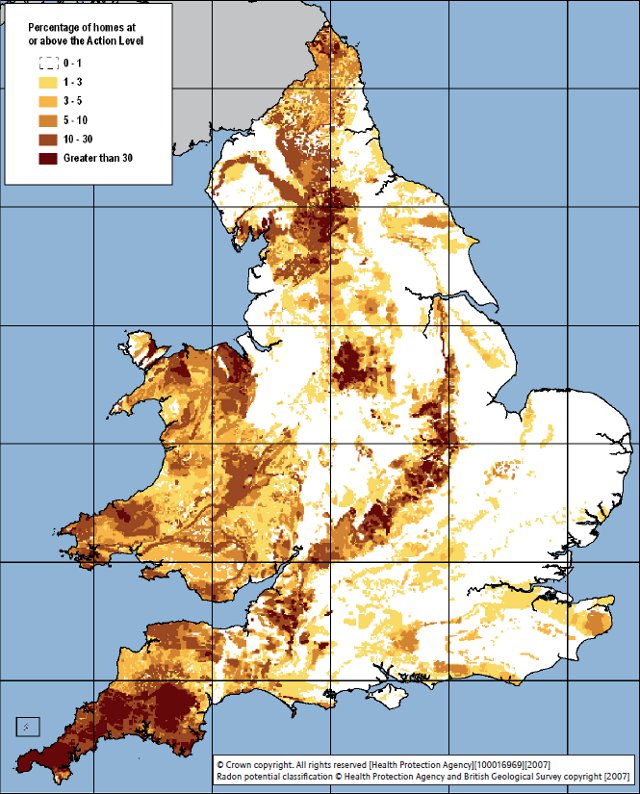
The map is graded by the percentage of homes in that area which have a level of radon beyond the action level of 200 becquerels per cubic metre (200 radon decays per second per cubic metre).

There are a number of important radon hotspots in the UK. The most noticeable one is Cornwall in the south-west where the average UK background dose is 7.8 mSv, nearly three times the national average. This is due to the presence of igneous granite, which naturally contains more uranium (10-20 parts per million) than other rocks.

Radioactive areas tend to be hilly, where igneous rocks have been forced to the surface or left behind by the erosion of softer sedimentary rocks (the Chiltern Hills are particularly radioactive, for example). The Yorkshire Dales sit on top of an underground deposit of pink granite called the Wensleydale Granite that lies underneath the Askrigg Block, and the Peak District features many granite outcroppings.

Biosphere lungs

Some people refer to the rainforests as “Earth’s lungs”. In reality this is quite far from the truth, as rainforests actually contribute little (net) oxygen to Earth’s atmosphere; 70% of oxygen production is done by water-bourne green algae and the cyanobacteria present in every habitat on Earth.

Biosphere 2, a sealed ecological system built in Arizona to study the interaction between different forms of life and as a test of the possibility of using closed systems in space colonisation, also had lungs.

Biosphere 2’s oxygen came from the facility’s six biomes: a 1900 square meter rainforest, an 850 square meter “ocean”, a 450 square meter mangrove wetland, a 1300 square meter savannah grassland, a 1400 square meter fog desert and a 2500 square meter agricultural system.

During the day the heat of the Arizona sun would cause the air inside the facility to expand. In order to avoid the large pressure difference that this would create (5000 Pa, or 5% of standard atmospheric pressure), Biosphere 2’s creators included two giant hemispherical “lungs”.

As the air inside the facility expanded it would flow through underground tunnels into the lungs. Each lung contained a large weight hanging from a rubber sheet; as the air expanded during the day the increased pressure would raise the weight into the air. In the evening, as the air cooled, the weight would pull the rubber sheet back down and push air back into the facility, thereby equalising any pressure difference as it appeared.

Source: lumierefl

William Dempster, “Biosphere 2 engineering design”, Ecological Engineering 13 (1999): 31-42 doi:10.1016/S0925-8574(98)00090-1 (.PDF).

Anscombe’s quartet

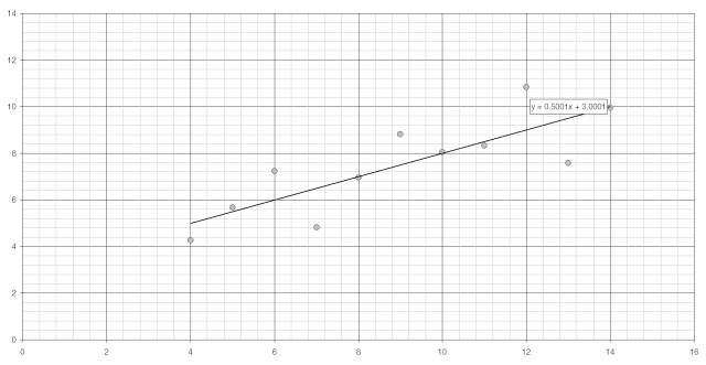
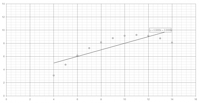
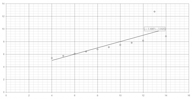
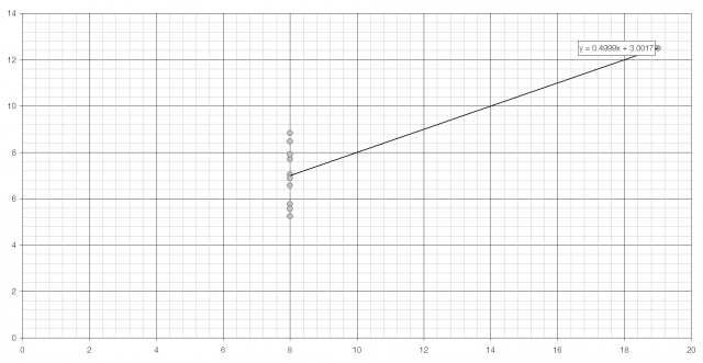
Anscombe’s quartet is four sets of data that are used to demonstrate the importance of graphing data.

Set 1 Set 2 Set 3 Set 4
x y x y x y x y
10 8.04 10 9.14 10 7.46 8 6.58
8 6.95 8 8.14 8 6.77 8 5.76
13 7.58 13 8.74 13 12.7 8 7.71
9 8.81 8 8.87 9 7.11 8 8.84
11 8.33 11 9.26 11 7.81 8 8.74
14 9.96 14 8.10 14 8.84 8 7.04
6 7.24 6 6.13 6 6.08 8 5.25
4 4.26 4 3.10 4 5.39 19 12.5
12 10.8 12 9.13 12 8.15 8 5.56
7 4.82 7 7.26 7 6.42 8 7.91
5 5.68 5 4.74 5 5.73 8 6.89
Mean 9 7.50 9 7.50 9 7.50 9 7.50
Variance 11 4.13 11 4.13 11 4.12 11 4.12
PMCC 0.82 0.82 0.82 0.82

Each set of data has near-identical statistical properties: the same average and variance (for both x and y), and the same product moment correlation coefficient and linear regression line. When plotted, however, they look entirely different. (The scale of the last graph is different from the others.)

You can download Anscombe’s quartet as an Excel spreadsheet.

Francis Anscombe, “Graphs in Statistical Analysis”, American Statistician 27(1) (1973): 17‑21. http://www.jstor.org/stable/2682899 (.PDF).

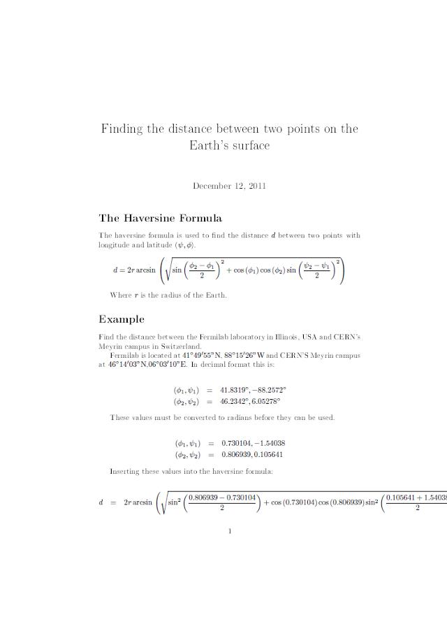
Haversine formula

The haversine formula is used to calculate the distance between two points on the Earth’s surface specified in longitude and latitude.

d is the distance between two points with longitude and latitude (ψ,φ) and r is the radius of the Earth.

As an example I have calculated the distance between Fermilab in Illinois (41° 49′ 55″ N, 88° 15′ 26″ W) and CERN’s Meyrin campus in Switzerland (46° 14′ 3″ N, 6° 3′ 10″ E). There’s a little too much maths for this site to handle so I have included a .PDF file of the working below.

The value calculated is 7084 km, which isn’t quite correct. This is because the formula assumes that the Earth is a perfect sphere when in fact it is an oblate spheroid. To compensate for this Vincenty’s Formulae must be used; these are much more complicated but give a more accurate value of 7103 km.

Patterns in birthdays

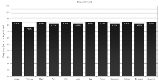
If births were evenly distributed throughout the year (i.e. a 1 in 365 chance of being born on any given day) then the graph of number of births against birth month would look like the one below:

You’re least likely to be born in February, because it only has 28 days, and then slightly more likely to be born in the 31-day months of January, March, May, July, August, October and December than in the 30-day months of April, June, September and November.

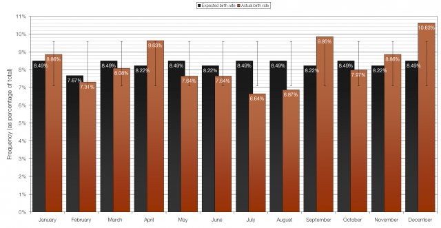
I took the data from nearly a thousand pupils and looked at how their dates of birth compared with the expected values. (Included with the data are error bars of one standard deviation.)

The results for April, September and December (particularly December) show birth rates above what would be expected if births are random, and the results for July and August show depressed birth rates.

Considering the months where births are more likely than they should be and working backwards we find the most likely “sex months” to be March, July and December. These seem fairly sensible as all of these months coincide with major holiday periods: Easter, the long Summer Holiday and Christmas/New Year. People are more likely to be “celebrating” and to have more free time during these periods, and March and December have long, cold and dark nights when people are more likely to stay indoors in the evening than go out.

The “sex months” for the lowest birth rates are more puzzling: October and November. I suspect that it has to do with Seasonal Affective Disorder (SAD) and that the generalised depression that comes with SAD includes reduced sex drive; this is combated come December by the general presence of good cheer and plenty of alcohol to lower inhibitions. It is also possible that parents are deliberately choosing when to conceive in order to avoid their child being the youngest in the school year, something that has been shown* to have a negative effect.

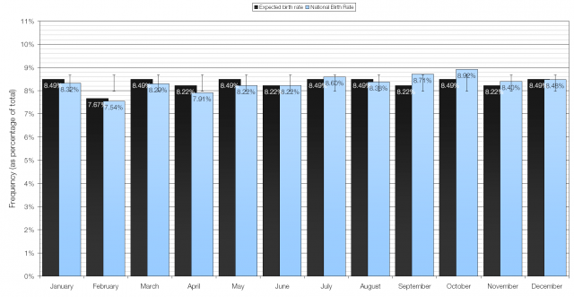
Update: Thanks to @S3ym5n I’ve now included national data for 2010.

In the national data it is September and October that show birth rates above what is expected, making December and January the most popular sex months. April appears to be the only month with a significantly lower birth rate, making July, when people are out and about in the nice weather rather than stuck indoors, the least popular sex month.

Continue reading