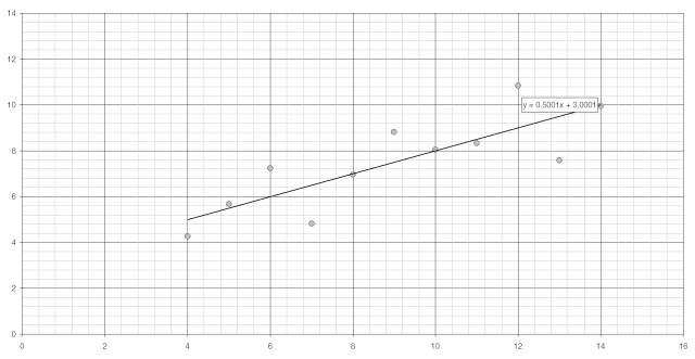
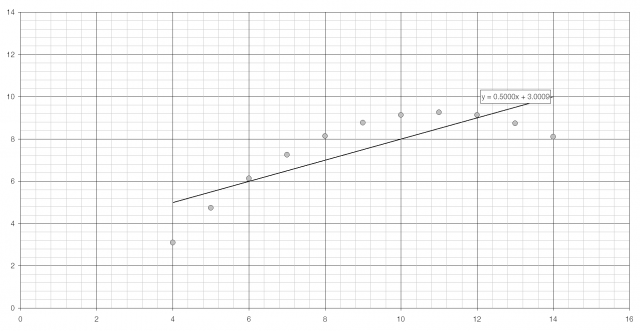
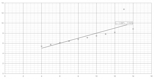
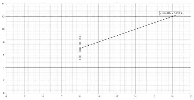
Anscombe’s quartet is four sets of data that are used to demonstrate the importance of graphing data.
| Set 1 | Set 2 | Set 3 | Set 4 | |||||
| x | y | x | y | x | y | x | y | |
| 10 | 8.04 | 10 | 9.14 | 10 | 7.46 | 8 | 6.58 | |
| 8 | 6.95 | 8 | 8.14 | 8 | 6.77 | 8 | 5.76 | |
| 13 | 7.58 | 13 | 8.74 | 13 | 12.7 | 8 | 7.71 | |
| 9 | 8.81 | 8 | 8.87 | 9 | 7.11 | 8 | 8.84 | |
| 11 | 8.33 | 11 | 9.26 | 11 | 7.81 | 8 | 8.74 | |
| 14 | 9.96 | 14 | 8.10 | 14 | 8.84 | 8 | 7.04 | |
| 6 | 7.24 | 6 | 6.13 | 6 | 6.08 | 8 | 5.25 | |
| 4 | 4.26 | 4 | 3.10 | 4 | 5.39 | 19 | 12.5 | |
| 12 | 10.8 | 12 | 9.13 | 12 | 8.15 | 8 | 5.56 | |
| 7 | 4.82 | 7 | 7.26 | 7 | 6.42 | 8 | 7.91 | |
| 5 | 5.68 | 5 | 4.74 | 5 | 5.73 | 8 | 6.89 | |
| Mean | 9 | 7.50 | 9 | 7.50 | 9 | 7.50 | 9 | 7.50 |
| Variance | 11 | 4.13 | 11 | 4.13 | 11 | 4.12 | 11 | 4.12 |
| PMCC | 0.82 | 0.82 | 0.82 | 0.82 | ||||
Each set of data has near-identical statistical properties: the same average and variance (for both x and y), and the same product moment correlation coefficient and linear regression line. When plotted, however, they look entirely different. (The scale of the last graph is different from the others.)
You can download Anscombe’s quartet as an Excel spreadsheet.
Francis Anscombe, “Graphs in Statistical Analysis”, American Statistician 27(1) (1973): 17‑21. http://www.jstor.org/stable/2682899 (.PDF).


