There are two main ways of giving longitude and latitude: in degrees, minutes and seconds, and in decimal degrees. For example: the current headquarters of the Institute of Physics could be given as 51° 31′ 18.0721″N, 0° 8′ 42.8759″W in degrees, minutes and seconds format; or as 51.521687, -0.145243 in decimal degrees. (Note the absence of cardinal directions in the decimal degrees format: positive latitude values are taken to be north, with negative values being south, and positive longitude values taken to be east, and negative values west.)
Lines of longitude are great circles, each one the same size, running around the Earth and crossing both the north and south poles. When quoting the position of an object on Earth’s surface in terms of its longitude, the degree of precision is not affected by the longitude in question.
| Precision | Error |
| 1.0° / 1.0° 0′ 0″ | ± 111 km |
| 0.1° | ± 11.1 km |
| 0° 1′ 0″ | ± 1.85 km |
| 0.01° | ± 1.11 km |
| 0.001° | ± 111 m |
| 0° 0′ 1″ | ± 30.9 m |
| 0.0001° | ± 11.1 m |
| 0.00001° | ± 1.11 m |
| 0.000001° | ± 0.111 m |
Unlike lines of longitude, not all lines of latitude are the same length. At 80° latitude the length of the line of latitude is only 17.3% of that at the equator. This means that the level of precision changes with latitude – each division of the latitude line is much smaller at you approach the north pole.
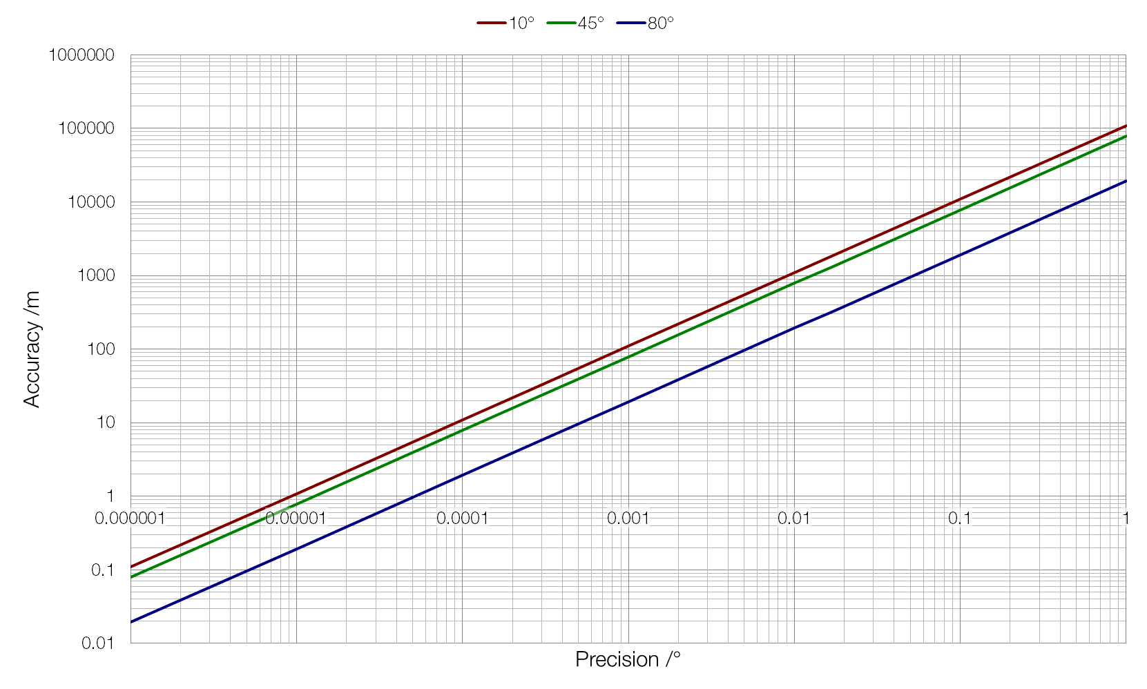
As you can see in the graph above, the change is not linear with latitude. The same 35° difference in latitude yields very different results in terms of accuracy.
This means that different locations will need to use different degrees of accuracy in their GPS coordinates if you want people to be able to find their way around. At Quito, near the equator at 0.23°N, a precision of 0.001° would lead to an accuracy of ± 111 metres, but at Helsinki, much further north at 60.2°N, this accuracy is improved to ± 55 metres.

 ) isn’t always good enough for physics. If we want to multiply two vectors (quantities that have both size and direction) like force or velocity, then the direction of those vectors matters. The result of a 3 N force multiplied by a 4 N force will depend on their relative directions: if they are pointing in the same direction we will get a different answer to if they are at right angles to each other.
 and
and  then we will get a different answer to than if we had found the cross product of
  . This makes sense when you consider the vector nature of the cross product: a vector to the right multiplied by a vector upwards shouldn’t produce the same result as a vector upwards multiplied by a vector to the right: the result has the same magnitude, but points in a different (opposite) direction.