Monthly Archives: January 2010

Fruit Gums and graphs

All the data from my Fruit Gums experiment has one continuous variable (the number of gums) and one discrete variable variable (either box number or flavour) so the physicist’s standard graph – the x-y scatter plot – isn’t suitable. This made it a good opportunity to try out some different graph/chart types.

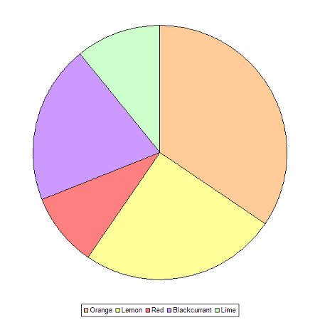
A pie chart shows the relative contribution of each item to the whole.
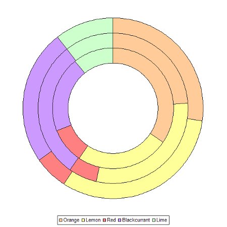
The doughnut chart builds on the pie chart by enabling more than one set of data to be plotted – in this case all three boxes at once.
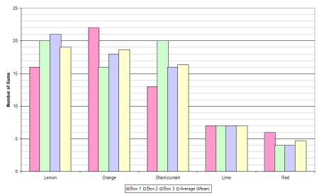
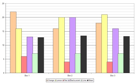
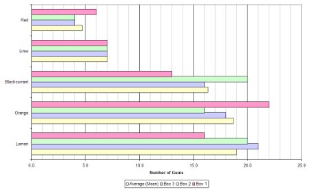
Bar charts come in two forms: horizontal and vertical. In this case there are two ways to group the bars: by flavour or by box number.
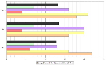
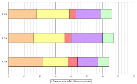
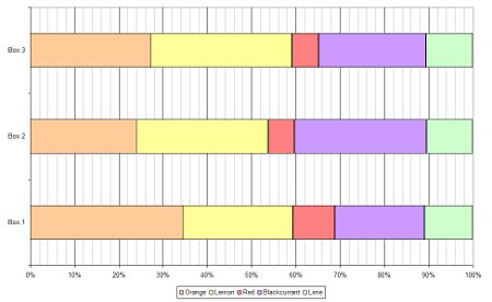
With lots of data a bar chart can become crowded and confusing and that’s where stacked bar charts become useful. A stacked bar chart overcomes this problem and can be done in two different ways: using absolute values or by percentage.
Aspect ratio

I hate it when I see someone watching television in the wrong aspect ratio; for some reason it really bugs me.

Aspect ratio is always given as horizontal:vertical. Television programmes are usually produced in one of two formats: “regular” 4:3 and “widescreen” 16:9.

If you watch a 4:3 programme with a widescreen television on its 16:9 setting everything looks stretched – people look short and fat.

A widescreen television should be using the 4:3 setting to watch a 4:3 programme. This wastes some screen real estate with black bars at each side of the screen, but it prevents distortion.

Likewise, a 4:3 television should be using the 16:9 setting to watch a 16:9 programme. This creates the familiar “letterboxing” effect at the top and bottom:

For movies a ratio of 2.35:1 is very common but others are frequently used. Ben Hur was shot in an incredible 2.76:1.

Philips have gone as far to produce a “cinema-ratio” TV:

Teaching statistics with Fruit Gums

Fruit Gums can be used to demonstrate the concept of standard deviation.

Calculating standard deviation is easy, it’s simply:

Which, with the right teaching, and enough practice, anyone can learn to do. Understanding what standard deviation means is far more difficult.

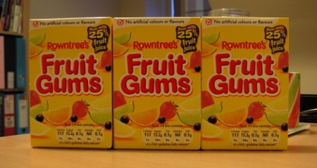
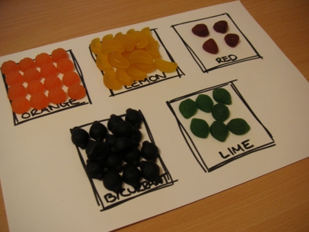
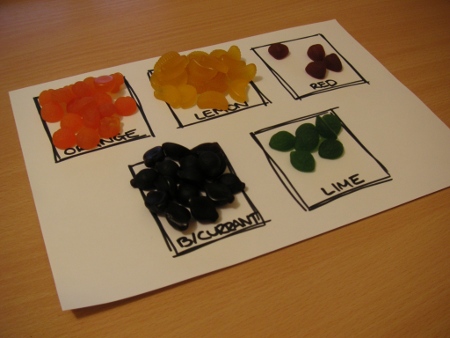
I bought three boxes of Fruit Gums …

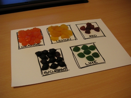
… and sorted them by flavour.

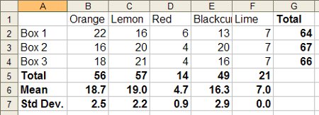
I collected the data in Excel which yielded the following spreadsheet:

The issue of standard deviation is summed up in the question: “What is the largest and smallest number of each flavour that you can expect to find in each box?”

Lime is a special case. The were seven lime fruit gums in each box, meaning the standard deviation was zero. You could therefore – based on this sample alone – expect to find seven lime fruit gums in each box.

The standard deviation of a sample is a measurement of its spread, it tells you the mean distance from the mean.

For lemon fruit gums the mean is 19.0 plus or minus a standard deviation of 2.2. You could therefore expect to find – on average, based on this sample alone – between 16.8 and 21.2 lemon gums in each box. A box containing 25 lemon gums would be way outside the expected average contents.

The only outlier in this dataset is the first box’s orange gum count; based on the data collected we would expect a maximum of 21.2 orange gums. Clearly more fruit gums research is required.