I downloaded the longitude and latitude of all the UK postcodes from Free Map Tools and imported them into Excel. Inspired by dy/dan’s excellent “What Can You Do With This?” segment I started playing around with the data.
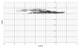
When I first plotted the data they didn’t look like much:
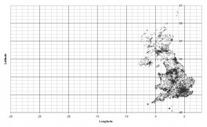
But with the scale adjusted a picture starts to form:
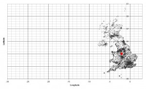
The red marker in the “map” below shows the mean average of the postcodes.
Because postcodes have to cluster around centres of population the mean marker shows the UK’s approximate centre of population; the clustering is clearly visible around major cities such as London, Birmingham, Glasgow and Liverpool.
The clustering effect also explains why Scotland, Wales and Northern Ireland, with population densities of 65, 141 and 125 people per square kilometre respectively, are much less well-defined than England which has an average density of 380 people per square kilometre [source].
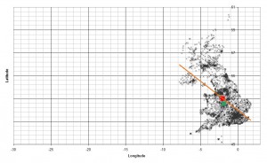
For fun, I also added a line-of-best-fit and the median point. I’m not sure they really mean anything but, hey, I was on a roll.


