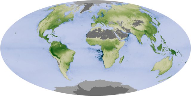
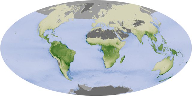
The maps below show the production of carbon dioxide by plants versus its absorption. The greenest areas are those that are storing the most carbon, where plant growth is greatest (grey areas indicate no plant life).

The map above shows the world in August, summer in the northern hemisphere. Note the particularly heavy absorption of carbon dioxide in the tropical rainforests of Bolivia, Peru, Brazil and other South American countries and the production of algae off the west coast of Africa.
The map below shows a much different picture, the world in December when it is winter in the northern hemisphere and summer in the southern hemisphere.

Storage of carbon dioxide by plants reaches its lowest point in December, causing the atmospheric concentration of carbon dioxide to peak.
It’s easy to see why plant production peaks when maps of incoming solar radiation for August and December are compared. The bright yellow areas are those receiving high amounts of incoming sunlight; the dark red areas receive the least.

August 2010

December 2010
Also interesting to compare are maps showing the balance of radiation. The orange areas in the maps below are those which are absorbing more radiation than they emit, and green areas are those which emit more radiation than they absorb.
The difference between areas near the equator that receive year-round sunlight and areas nearer the poles where sunlight is seasonal is quite marked; Greenland remains a net radiator throughout the year due to northerly position and its year-round white reflective coating of ice and snow.

August 2010

December 2010