All the data from my Fruit Gums experiment has one continuous variable (the number of gums) and one discrete variable variable (either box number or flavour) so the physicist’s standard graph – the x-y scatter plot – isn’t suitable. This made it a good opportunity to try out some different graph/chart types.
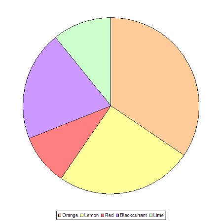
A pie chart shows the relative contribution of each item to the whole.
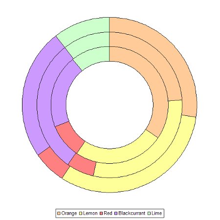
The doughnut chart builds on the pie chart by enabling more than one set of data to be plotted – in this case all three boxes at once.
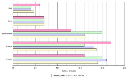
Bar charts come in two forms: horizontal and vertical. In this case there are two ways to group the bars: by flavour or by box number.
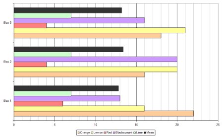
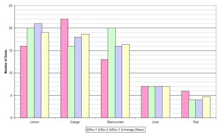
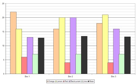
With lots of data a bar chart can become crowded and confusing and that’s where stacked bar charts become useful. A stacked bar chart overcomes this problem and can be done in two different ways: using absolute values or by percentage.
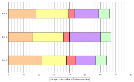
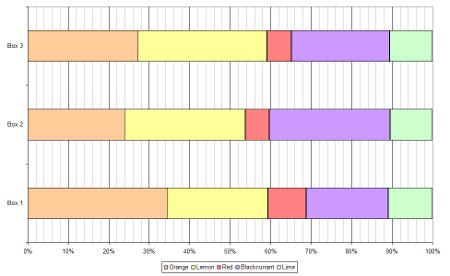
Where can I buy the elusive “red” fruit?
Please update all of your charts with correct flavour which is of course “strawberry”.
I refuse to believe they are actually strawberry flavour.
You don’t have to believe me, you can take Mr Rowntree’s word for it:
“Rowntree’s Fruit Gums were first introduced in 1893, making them one of Nestlé’s oldest current confectionery brands. They contain 25% fruit juice and no artificial colours or flavours and also come in five flavours: Orange, Blackcurrant, Strawberry, Lemon and Lime. They are available in Tubes, Sharing Bags, Multipacks and Cartons.”
http://www.rowntrees.co.uk/range/fruitgums.aspx