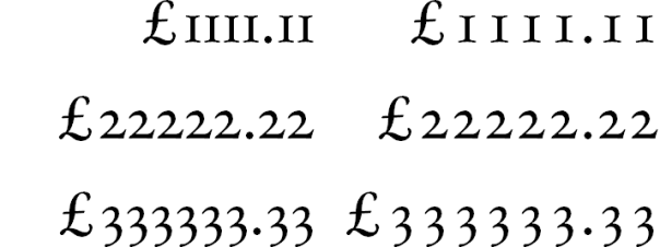
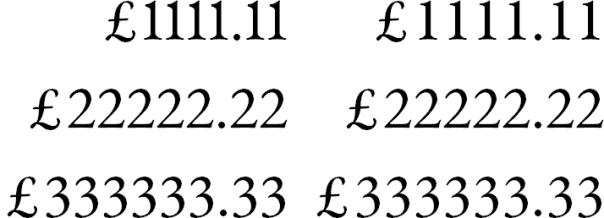
Are you using the correct sort of numbers? Numbers come in two forms: old style and lining.
 Old style figures
 Lining figures
The difference between old style and lining figures is how they sit relevant to the text’s baseline and x-height.


Generally speaking, old style numbers look better within normal text, because they keep the same “pattern” of ascenders and descender; and lining numbers look better when used with text set in all caps as they match the height of the line.
![]()
With the text in all caps the old style numbers stand out as odd, but the all caps text looks much better when the old style figures are replaced with lining figures.
![]()
With normal text, the old style figures help the text to look more normal, but the name of the supernova still stands out as looking a bit odd.
![]()
But the best option is a combination of both old style and lining figures as shown below.
![]()
Both old style and lining figures can come in proportional and monospaced (fixed-width) varieties. Monospaced figures are sometimes called tabular figures, because they are used in tables so that columns of tens, hundreds, thousands, etc. line up properly.

L-R: Proportional old style figures and tabular old style figures.

L-R: Proportional lining figures and tabular lining figures.
