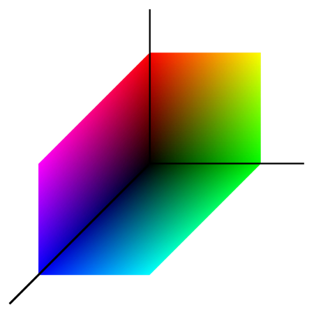
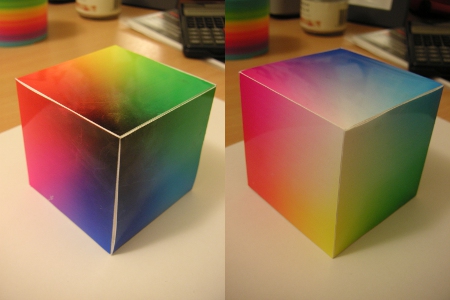
The two main political parties in the UK are traditionally associated with two of the primary colours of light: red (Labour) and blue (Conservative). I wondered what would happen if I associated the remaining colour, green, with the remaining political parties.
Let’s take the UK as a whole: 36.45% voted Conservative, 29.01% voted Labour, and the remaining 34.54% was distributed amongst the remaining polticial parties (23% of which was for Liberal Democrat).
RGB values go from 0-256, so the triplet for the country as a whole is (74, 88, 93) which gives this colour:

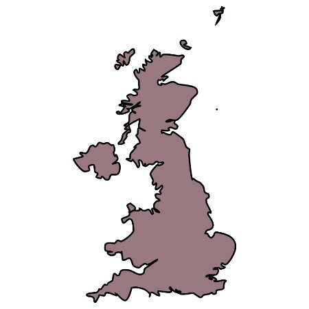
If I then assign the voter turnout (65.1%) to the brightness we have this colour:

This way, the higher the turnout the brighter the colour. But this messes with the colour balance both a constituency with 100% turnout for Labour and one with 100% voting for Conservative would be white. Assigning the transparency value to the turnout works better: a constituency with 100% vote for Labour or Conservative or Other but a very low turnout would be a very pale red/green/blue, whilst 100% vote with 100% turnout would be a vibrant bright red/green/blue.
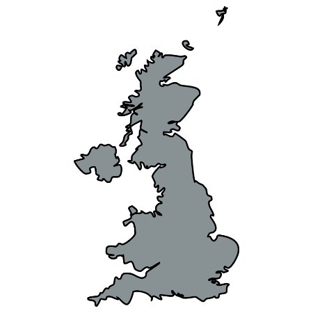
The UK is a dull blueish-gray, representing a fairly even mix of parties and low turnout. The 1997 Labour landslide victory shows a very different picture: Labour’s red colours are clearly visible.
So next, to mapping constituencies. Surrey is pretty boring, being entirely Conservative.
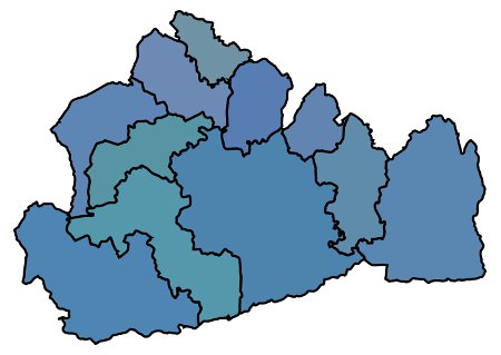
But nearby East Sussex is more interesting:
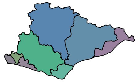
Unfortunately the green colour assigned to “other” makes it impossible to tell between those constituencies where Liberal Democrats won, and the only Green seat in the country, Brighton Pavilion.
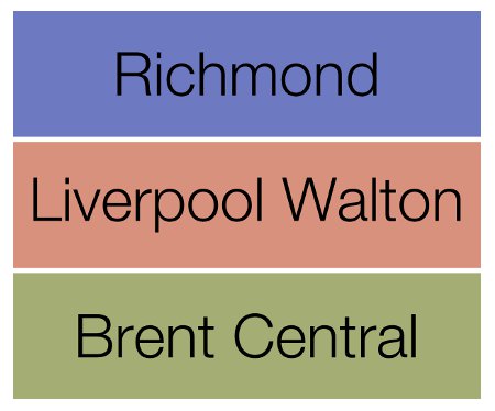
The effect is most noticeable with those seats regarded as “safe”:
Now there must be someone out there who can take this process and automate it …
