The Koch Snowflake (named after its inventor, the Swedish mathematician Helge von Koch) is a fractal with a number of interesting properties.

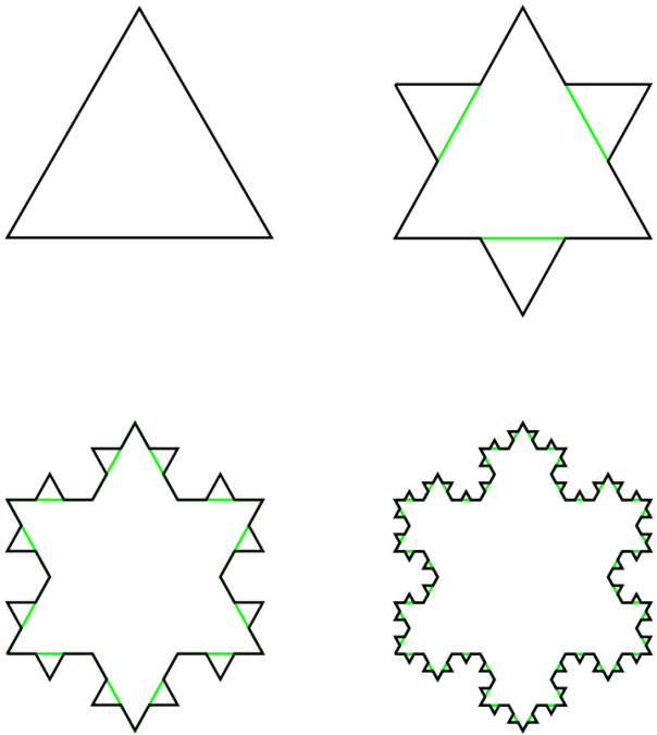
The first four generations of the Koch Snowflake
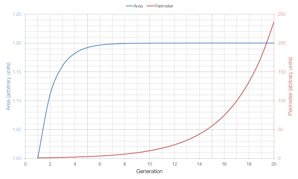
As the number of generations increases, the area of the snowflake increases, but it increases towards a limit: eight-fifths of the size of the first (triangular) generation. This is because each additional generation adds three triangles which are one-ninth the size of the triangle added in the previous generation (for a total increase of one-third), and the additional of increasingly small triangles has a lesser and lesser effect on the overall area as the number of generations increases.
But as the number of generations increases, the perimeter of the shape continues to grow, without approaching a limit: each generation of the Snowflake has a perimeter which is four-thirds of the previous generation’s perimeter. This is because the additional perimeter added each time is four times one-third of the length of each side, for a total increase of four-thirds, as opposed to the one-third increase in area. Because four-thirds is greater than one, the perimeter tends to infinity, whereas the area (which at one-third is less than one) does not.
As you can see from the graph above, the area approaches its limit very quickly, whereas the perimeter grows very quickly (which is why it has to be shown on a different axis).

Isn’t the area limit of the snowflake 1.6? (assuming the area of the original triagle is 1)
It doesn’t look like it. Looks like 1.2ish to me.
I worked out the limit of the area using sequences and series to be 1.21 (3sf). Also, how did you generate this graph?
In Excel.
it makes me realy dizy
How did you do the figure in Excel? I’m an Excel Visual Basic programmer and, staring at this diagram, thinking about the algorithm to calculate and store the coordinates, and plot the line segments at each iteration.
The figure of the snowflakes? Those weren’t created in Excel.