Worldmapper is a website that gives you the world “as you’ve never seen it before”.
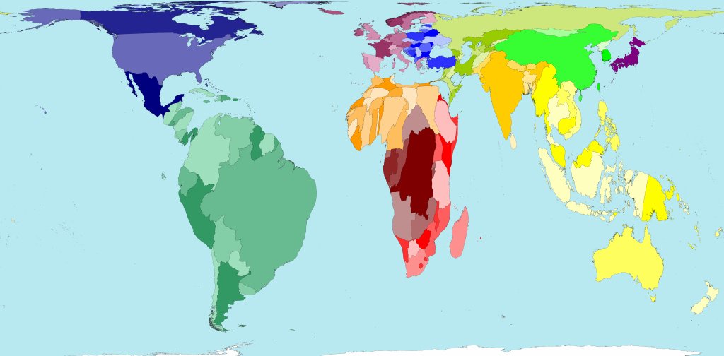
Land Area
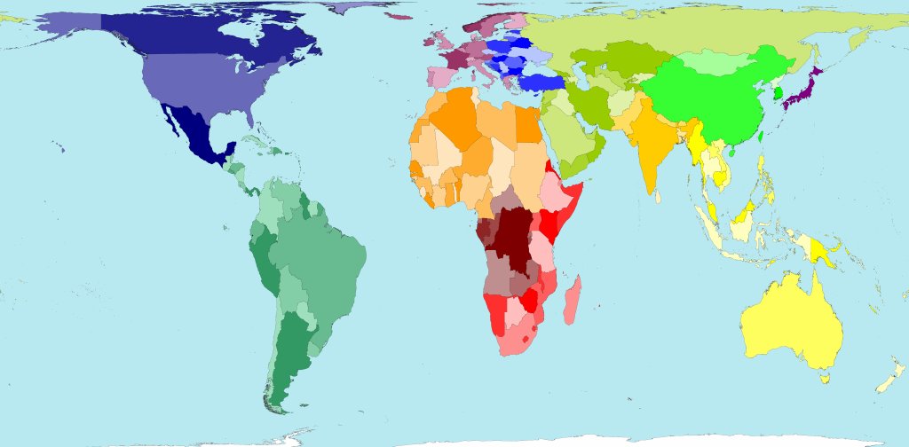
This is the map of the world you’re familiar with; the size of the country on the map represents the size of the country in real life:
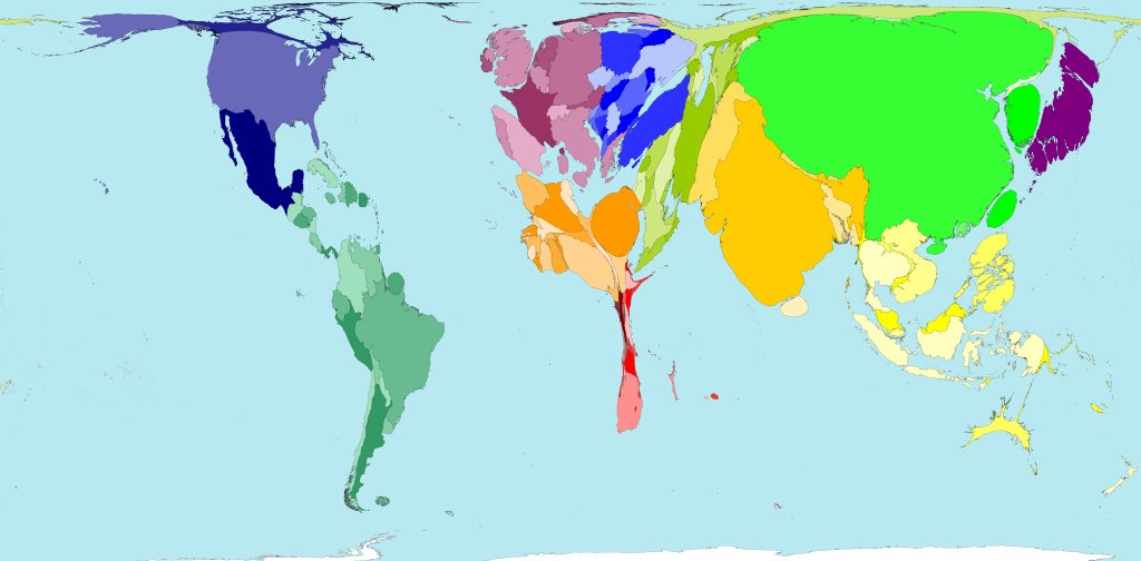
Population
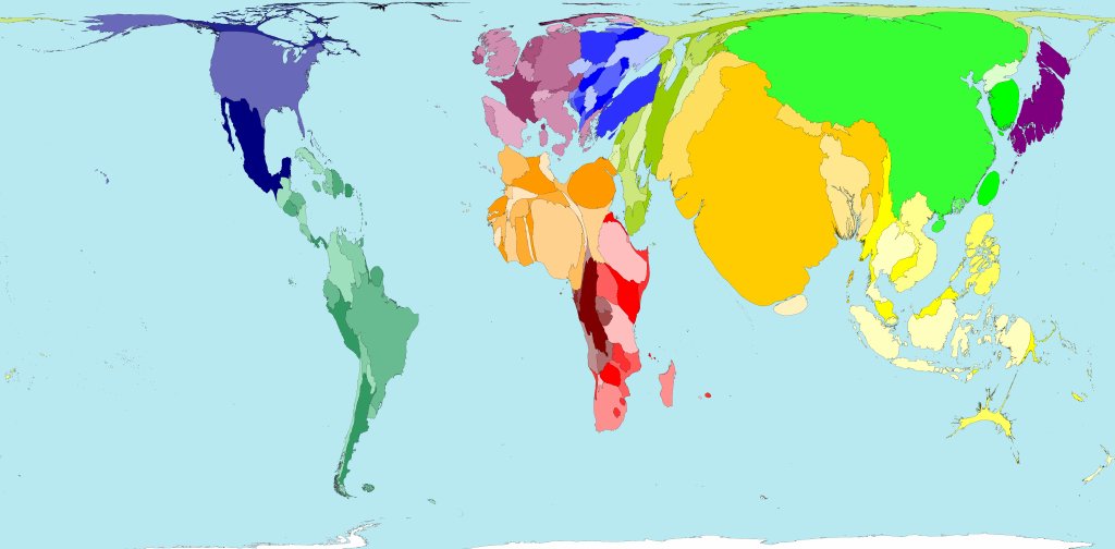
This is the same map, but now the size of the country represents the country’s population:
Notice how China and India, with huge populations and (relatively) not much land have ballooned in size whereas countries like Australia with lots of land but small populations have shrunk.
Nuclear Weapons
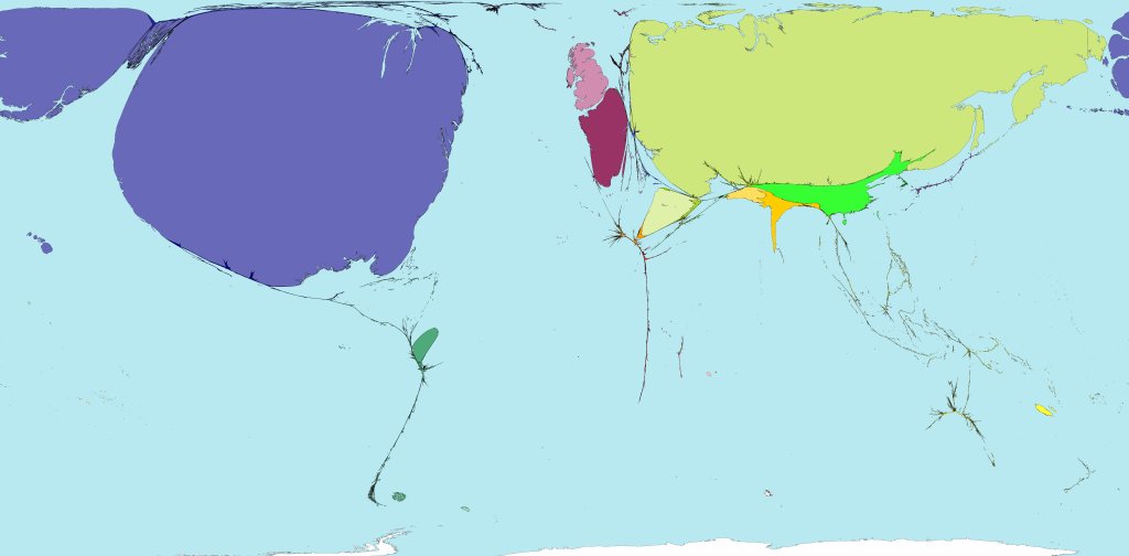
Most countries disappear completely:
The United States and Russia, with nearly 6000 warheads each are both enormous compared to the smaller nuclear states: the United Kingdom, France, China, India, Pakistan and Israel.
Nuclear Waste
The most interesting thing about this map is the size of France, which produces nearly 80% of its electrical power from nuclear sources.
Rainfall
On this map the largest countries are those that receive the most rainfall.
South America (particularly Brazil) and South East Asia become huge whereas North Africa and the Middle East become tiny.
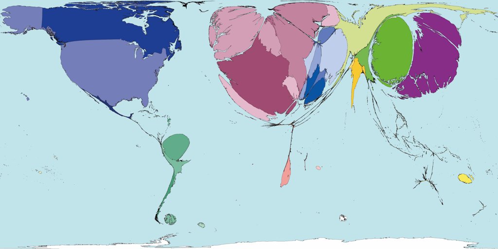
Access to Electricity
On this map almost the entire continent of Africa, where only a very small proportion of the population have access to electricity, disappears almost completely.
